
1.Overview
- Highly flexible, lightweight & high page speed
- Drag n drop modules with re-usable sections
- DIY easy theme settings with modern & creative designing
2.Basic Concepts
Before starting off with the theme working, here are a few things you need to know,
1- Modules
Interchangeable and self-contained objects that add functionality to your page are called modules. When combined correctly, they produce wonders for your UI/UX. You can drag and drop these wherever you wish on your website pages. Electro theme has 26 modules.
2- Templates
The sample layouts for different pages that come with the theme are called templates. Just replace the services and demo content on your website, and you’re ready to go live. There are pre-existing landing pages and homepage and system page templates in this theme.
3- Global Content
Information that appears on multiple pages, such as the header or footer of a website The drag and drop page editor allows you to edit global content directly.
3.Creating a Page
The steps to create a page are:
- Log in to your HubSpot Portal > Navigate to Marketing > Website / Landing Pages > Website page/Blog
- On the right side of the screen locate create option > select from website page/landing page/blog > Name the page > Select any template and click select template option
- Add or remove desired modules or reusable sections to your page > Publish the page. A page title is required before publishing a page on HubSpot CMS.
4.Changing Templates
In the electronic business, there are so many different topics you can cover in your content strategy. Therefore we have provided you with the best blog templates for your business. You can set blog templates and system templates for your electronic business using our theme.
4.1.Blog Templates
To change blog templates to electro theme:
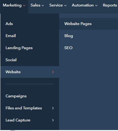
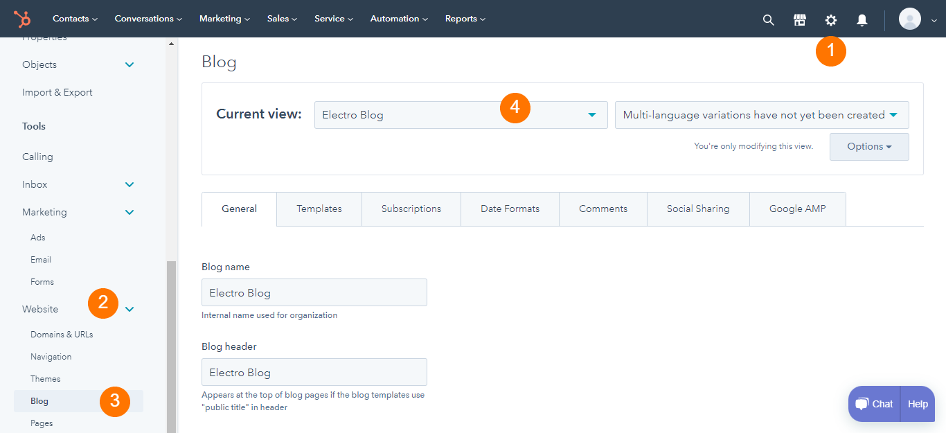
- After you log in to your HubSpot account > Go to settings > scroll down from the left panel> Website > select blog
- Select template option > Choose electro from current view option > Edit the template if you like > Publish blog
4.2.System Templates
For using electro system templates
-
- Log in to your HubSpot account > Settings > Website > Pages
- Select the system pages section from the top > set different system pages templates from the available options> Choose electro system pages > Save settings
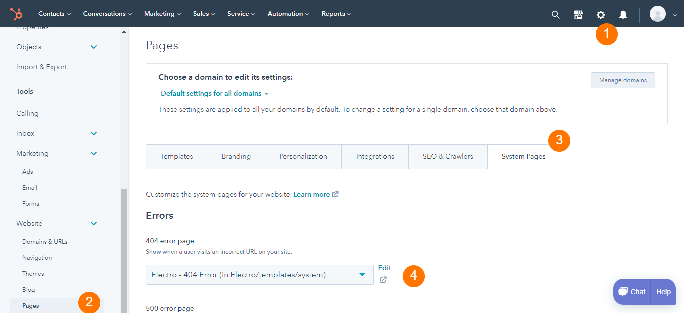
- The following system pages are present in the electro theme
- 404 Error Page
- 500 Error Page
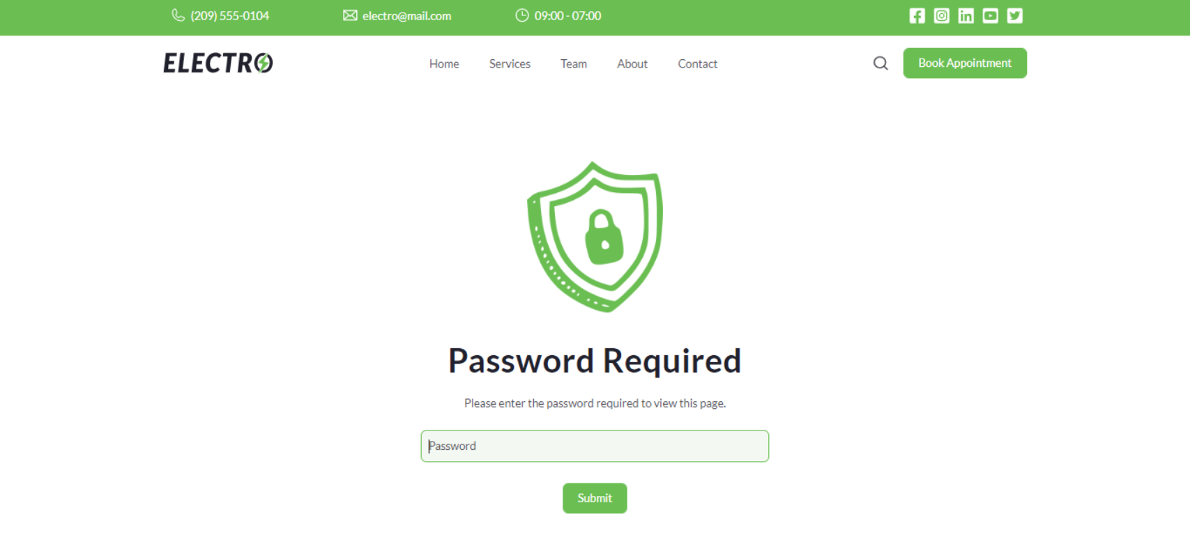
- Password Prompt
- Search Results
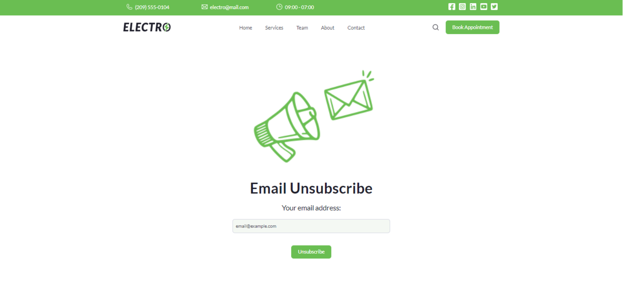
- Email Unsubscribe
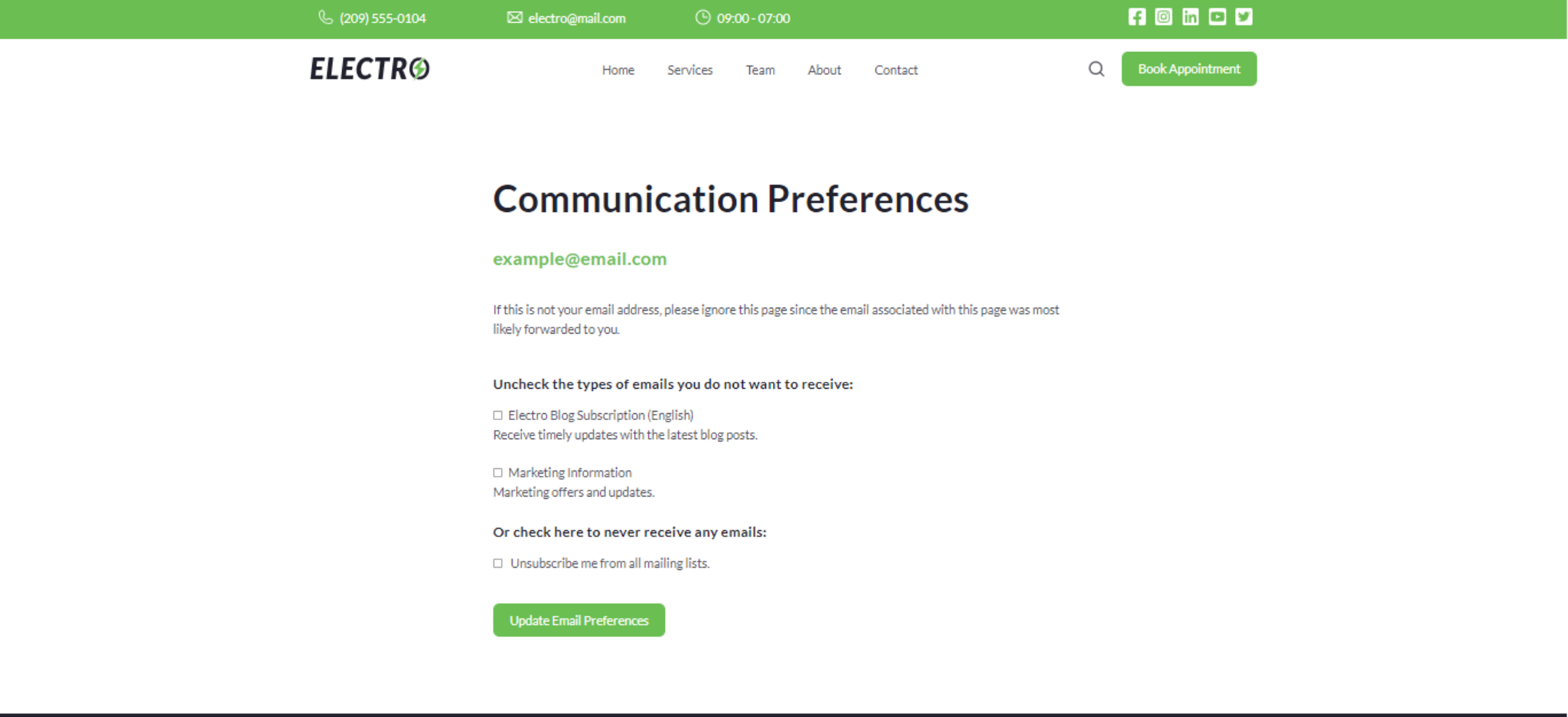
- Email Subscription Preferences
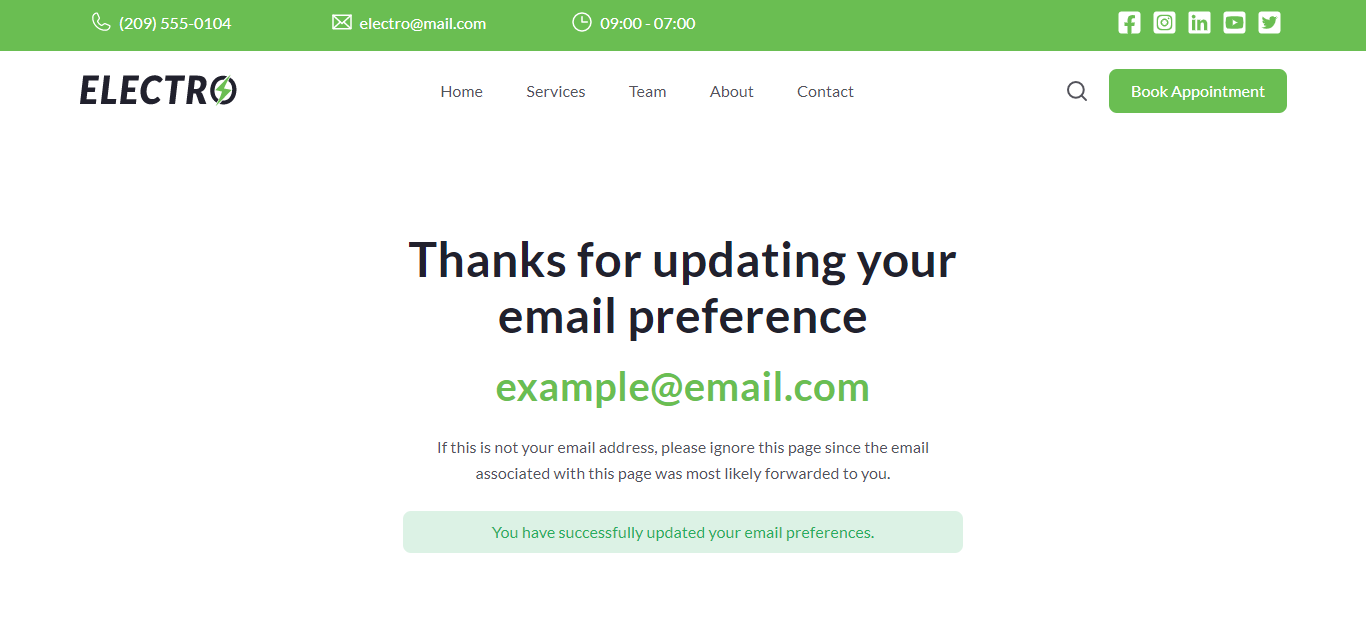
- Email Subscription Confirmation
4.3.Email Template
To change the email template
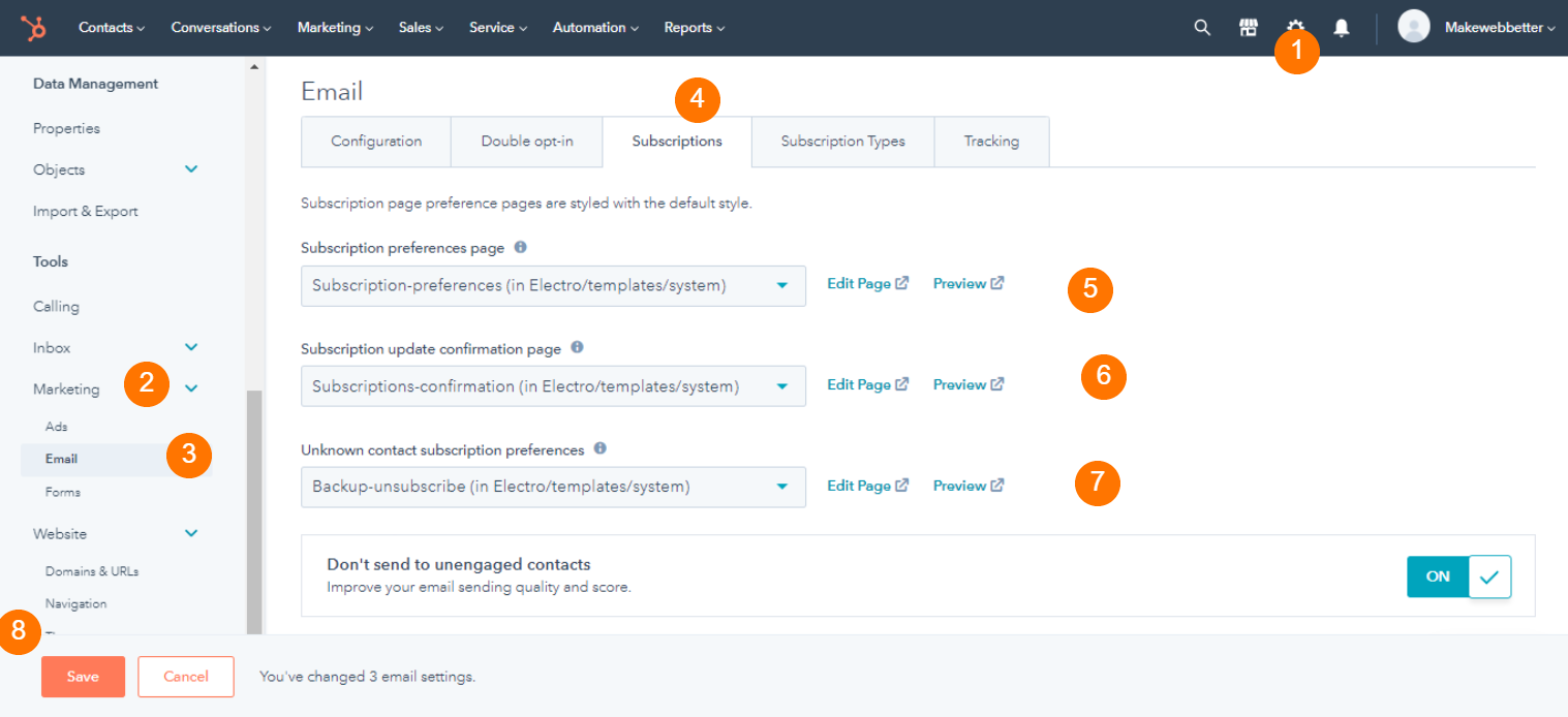
- From your HubSpot account, go to Settings > on the left side panel find Marketing > under marketing select Email
- Select subscription section > choose options to electro for subscription preferences subscription update confirmation page, and backup unsubscribe > Save settings.
5.Editing Theme Settings
After creating any website page, you can edit theme settings in the following way:
- Edit page > Go to the edit page panel from the left side. You will notice 3 tabs, Add, Content, and Theme.
- Select Theme > Hit edit theme settings > Make modifications >Publish Assets.
The following options are available on the edit them settings options:
5.1.Global Colors
Global colors are the basic colors for your everywhere on your websites. From the global color option, you can set the primary color, secondary color, heading, and background color of the template to be used on your website.
5.2.Global Fonts
You can set the global fonts that will be used everywhere on your website pages unless changed otherwise on separate pages. You can change the body font and color, and heading font and color.
5.3.Typography
Design text to be shown on your website pages with typography settings. You can change typography settings including desktop font, line height, and text transformation from capitalizing, uppercase, lowercase, letter spacing, mobile font size, and line height for Heading One, Heading Two, Heading Three, Heading Four, Heading Five, Heading Six and body. Additionally, you can set fonts, colors, and line height for normal and hover links
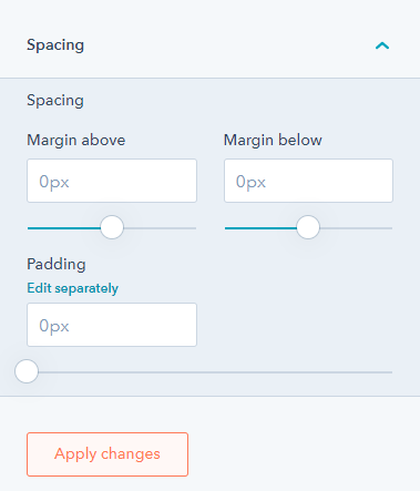
5.4.Spacing
The spacing setting allows you to create consistent spacings throughout your landing and website pages. You can adjust maximum content width and vertical spacing.
5.5.Buttons
For the buttons throughout your website, you can make global changes to them too. From the buttons option, you can change font size, line height, spacing, and corner radius. The filled and outlined button settings include the normal, focus, and hover option. (text, background, and border)
5.6.Forms
The form setting on your theme includes the title (text, background, spacing, corner, border), labels ( text & spacing), help text, fields ( inputs, GDPR, Rich texts) form ( background, spacing, border, corner) and error messages.
5.7.Tables
Under the tables option, you can change the table header (text & background), table footer, table body (text & background), and table cells (spacing & border).
5.8.Header
From the header option, you can enable/disable the header top bar with top bar background color, enable box-shadow, and change the background color. The menu option has desktop & mobile text font, hover font, active font, and other drop-down settings.
5.10.Blog Setting
From the blog setting option, you can enable a sidebar along with topics, and enable a subscription form. Other blog post settings include desktop & mobile font size & line height of the content, show/hide author’s name, timestamp, tags, and related posts, and border radius of the image.
5.11.System Page Settings
The system page settings are for different system pages like error 404, error 500, email unsubscribe, password prompt, etc. You can enable system page images, replace or remove their banner image, edit alt text and decide the image loading.
6.Edit Global Module
After creating a page, you will find 3 tabs on the edit page menu, namely, add, content, and theme. Create a new page or edit any page > Navigate to Edit page panel > Select Theme > Click edit theme settings > Scroll to the website header or website footer option > Edit available settings.
Please Note: Publishing the changes on these modules will take effect on all your pages so be sure while doing any modifications.
7.Reusable Sections In Theme
There are sections provided in the theme for your use on the website and landing pages. These are very user-friendly sections that save your time. To use them:
- Create a page or start editing one > hover over the page or any of the modules >Find and click on the plus icon > a list of theme reusable sections will appear on the right side of the screen.
- Select from the list > section will be appended to the website page > style or edit accordingly > publish
There are 7 reusable sections in the Electro theme, namely,
- Connect with Us
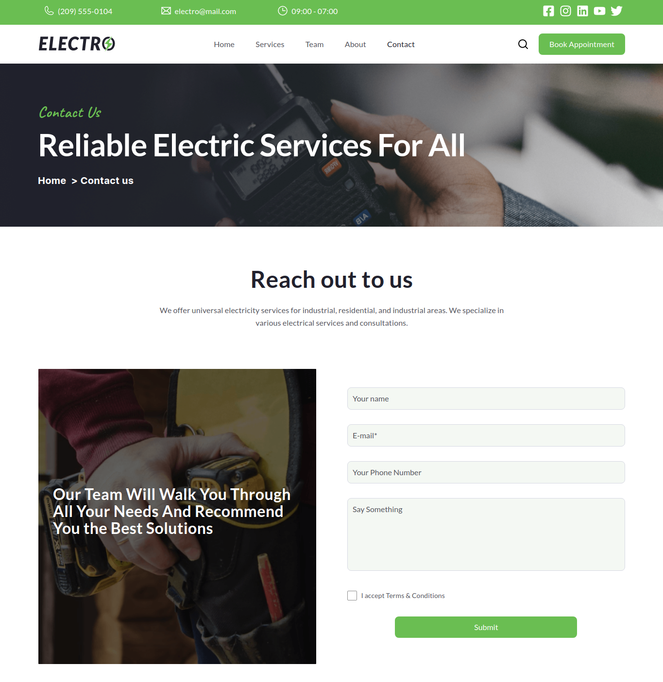
- Contact Us
- Get Started
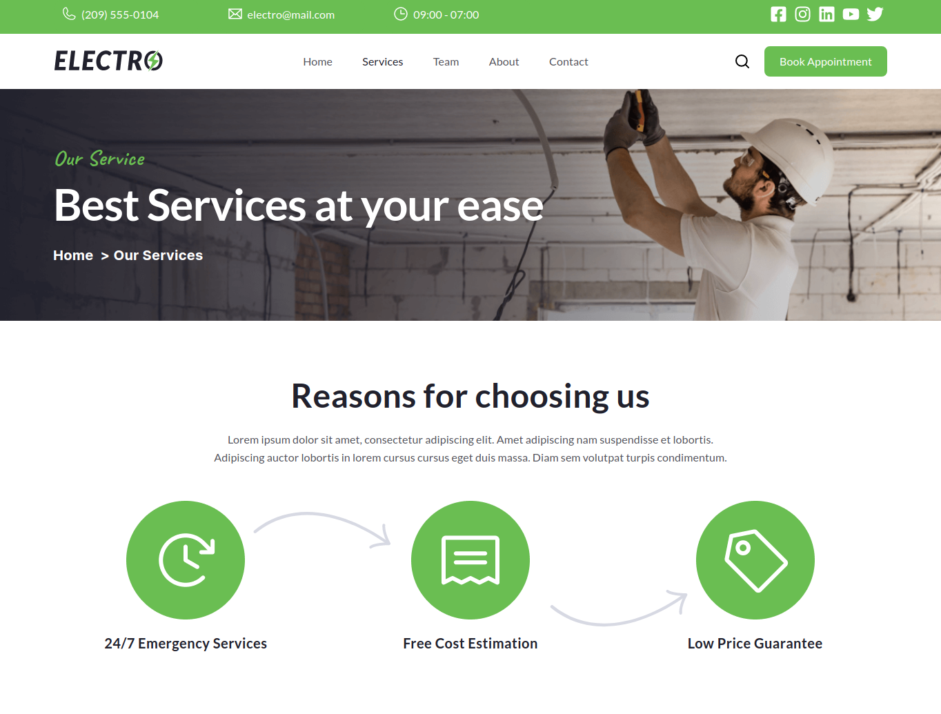
- Services
- Subscribe Now
- Two Column Content
- Two Column Image Text
- Two Column With Content And Video
8.Module Library
There are 26 modules in the Electro theme. You need to create a page using this theme in order to use its modules. You can drag and drop these modules anywhere on the page without coding. To delete any module, you need to hover over it, locate a bin icon, and click on it. Similarly, you can copy via the copy icon and edit a module via the pencil icon. There are 19 modules in this theme. Here is a complete list of modules.
8.1.Accordion
The accordion module can help you create a section to add FAQs or a large piece of content users can toggle to show or hide.
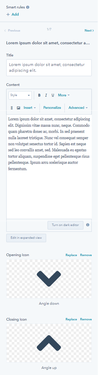
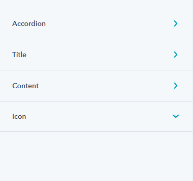
You can choose the position of the icon from the right or left, add multiple questions, add content, title, and opening, and closing icon. There are other settings like accordion, title, content, and icon that you can change from the style tab.
8.2.Banner
The banner module is one of the most important parts of your website page. The first thing that the users notice when they land at your website page. You can use it on your home page or about us page to inform the visitors about your marketing or other services.
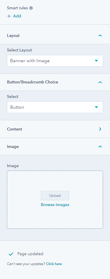
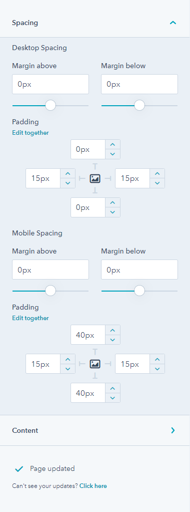
From its style tab you can adjust mobile & desktop spacing, padding, and content.
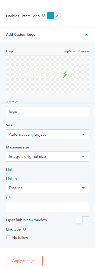
8.3.Logo
You can delete the logo too. You can enable a custom logo, and remove/replace the custom logo image, size, link, and maximum size.
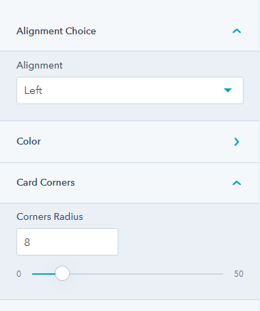
8.4.Card
The card module is for displaying cards on your website page along with some content and a featured image. Adjust the settings and add multiple cards on your landing pages.
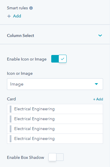
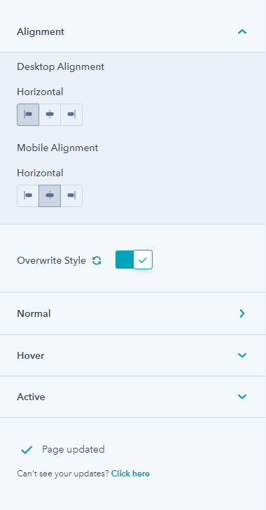
You can change the column layout to upto three columns, enable an icon box, add multiple cards, add images, headlines, image loading, set links, add icon box, and content. Under the style tab you can edit cards, image corner radius, set content alignment, and overwrite style.
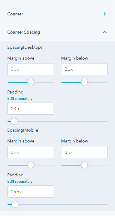
8.5.Counter
You can add a multi-column section to your page using the counter module.
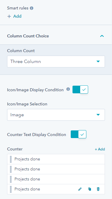
Add up to three columns, and add images, content, the maximum width of the container, card width, desktop and mobile alignment, spacing, and background color ( from the style tab). The style tab will help you in setting the counter spacing.
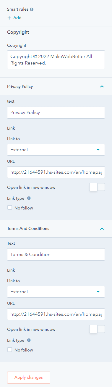
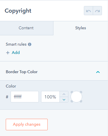
8.6.Copyright
Copyright is a global module. Any changes made to it will apply to all instances of it on your website. The copyright module allows users to edit the privacy policy and terms and conditions text & link.
From its style tab, you can change the border-top color.
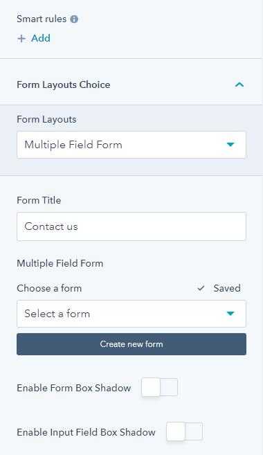
8.7.Custom form
Add a contact form on your website page using this module. Customize and use any existing form on your HubSpot CMS. You have form layout choices from single field form ( button at bottom or side button) or multiple field forms, enable form box-shadow, set form field title, overwrite button, and enable input field box-shadow. You can select any form or create a new form too.
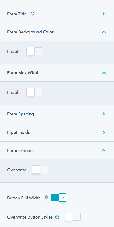
From its style tab, you can edit form title ( color, border-bottom, alignment), enable/disable form background color, enable/disable form max-width, desktop/mobile form spacing, input field background color and border, overwrite radius ( form corers), and enable/disable bottom full width.
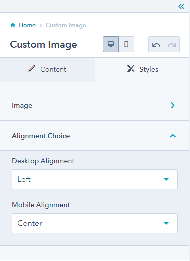
8.8.Custom Image
You can add any image to your website page using the custom image module.
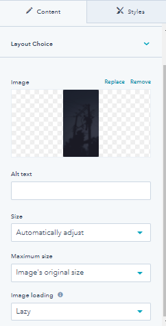
Other related settings for this module are desktop and mobile alignment, corner radius, alt text, size, image loading, and maximum image size.
8.9.Customizable Button
The button module can be added anywhere for directing the user to another page. You can easily edit your text, add links, enable icons, etc.
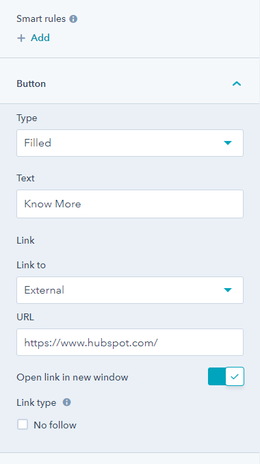
From its style tab, you can change mobile and desktop alignment and overwrite style.
8.10.Icon Box
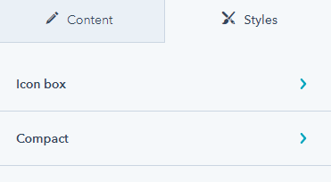
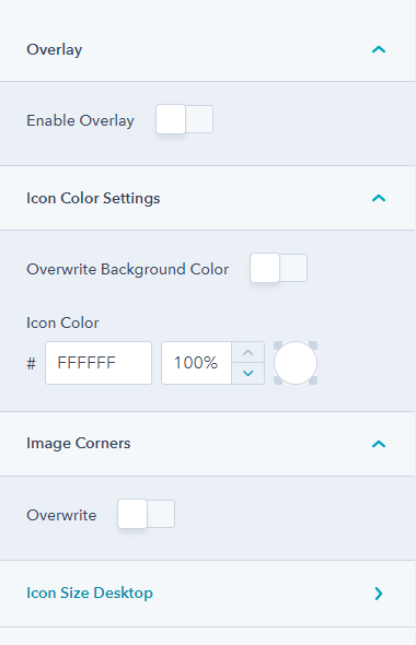
Icon box module adds a box with a preferred icon that you can remove or replace anytime. You can set columns, select icon/image, and enable shadow box.
The style tab also has options to edit the icon box corners, background color, and compact. ( desktop & mobile spacing, padding and icon)
8.11.Map
The map module will add a virtual map to your website. You can add your office location, edit the location pointer and mention your office branches in various locations.
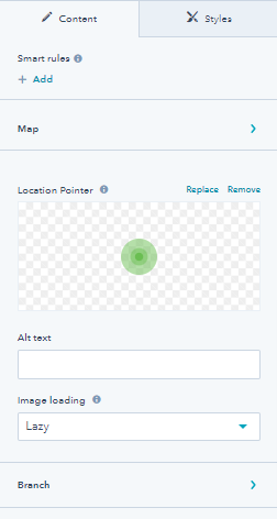
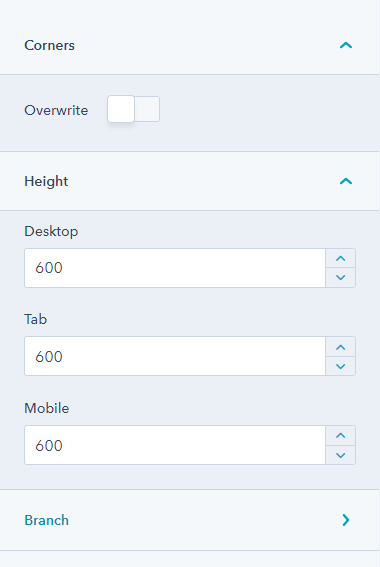
Map module settings include map API, Map JSON, Map zoom level, center latitude, and longitude. From its style tab, you can edit the corners and height of the map.
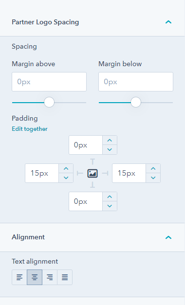
8.12.Our Partner
As the name suggests, the partner module is great for displaying your partners on the landing pages and website pages. You must have worked with different brands. Here is a perfect module to help you out.
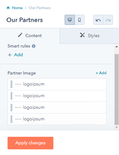
You add as many partners as you like and edit links for the same. Moreover, you can put up your partners’ logos, and their URLs, alt text, and image loading. The style tab will allow you to edit the desktop and mobile spacing, and padding.
8.13.Pricing Card
The pricing card module can be used to display your service pricing details on your landing pages. You can add multiple tabs, add descriptions, mini title, button, list, and price, and enable box-shadow from the content settings. Under special pricing card settings, you can add or change the background color.
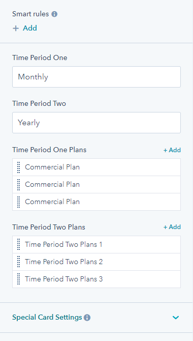
From the style tab, you can edit the tab font, background color, overwrite style, alignment, active card background color, and border color.
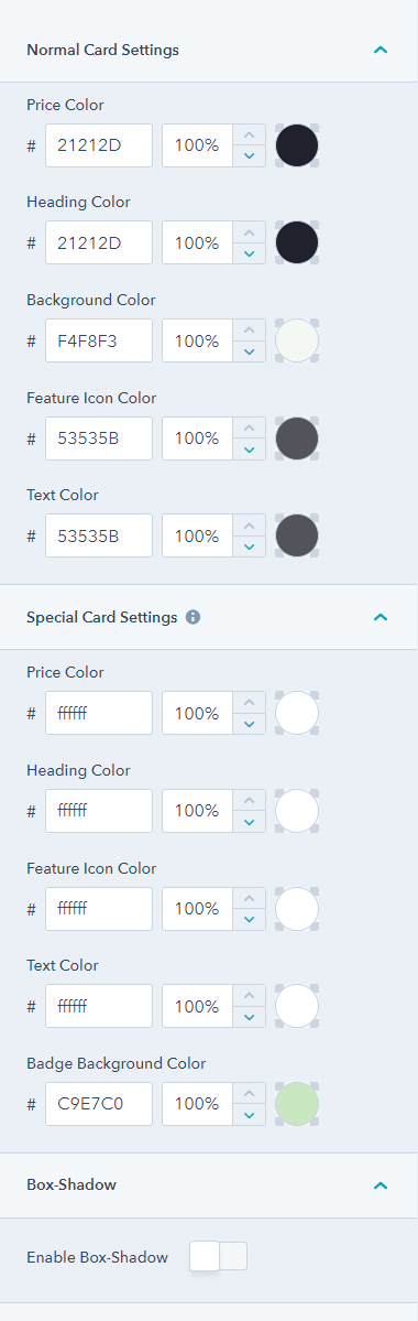
8.14.Process
You can illustrate a process using the process module step by step. You might display how your services are carried out for your electric business.
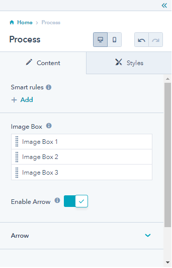
From the style tab, you can change the normal card settings and special card settings.
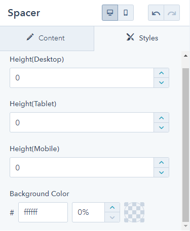
8.16.Spacer
The spacer module adds white space to the website and landing pages. Just search it from the theme module list and drag and drop it to your desired location.
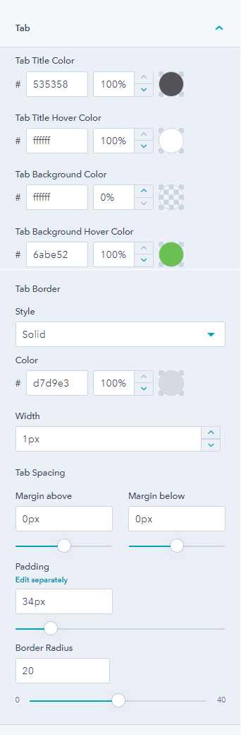
8.17.Tabs
You can add multiple tabs on your website with various headings with the tab module. You can further edit these tabs by clicking on the pencil icon.
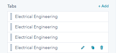
Additionally, you can change the title tab color, hover color, background, and background hover color, tab border, width, etc.
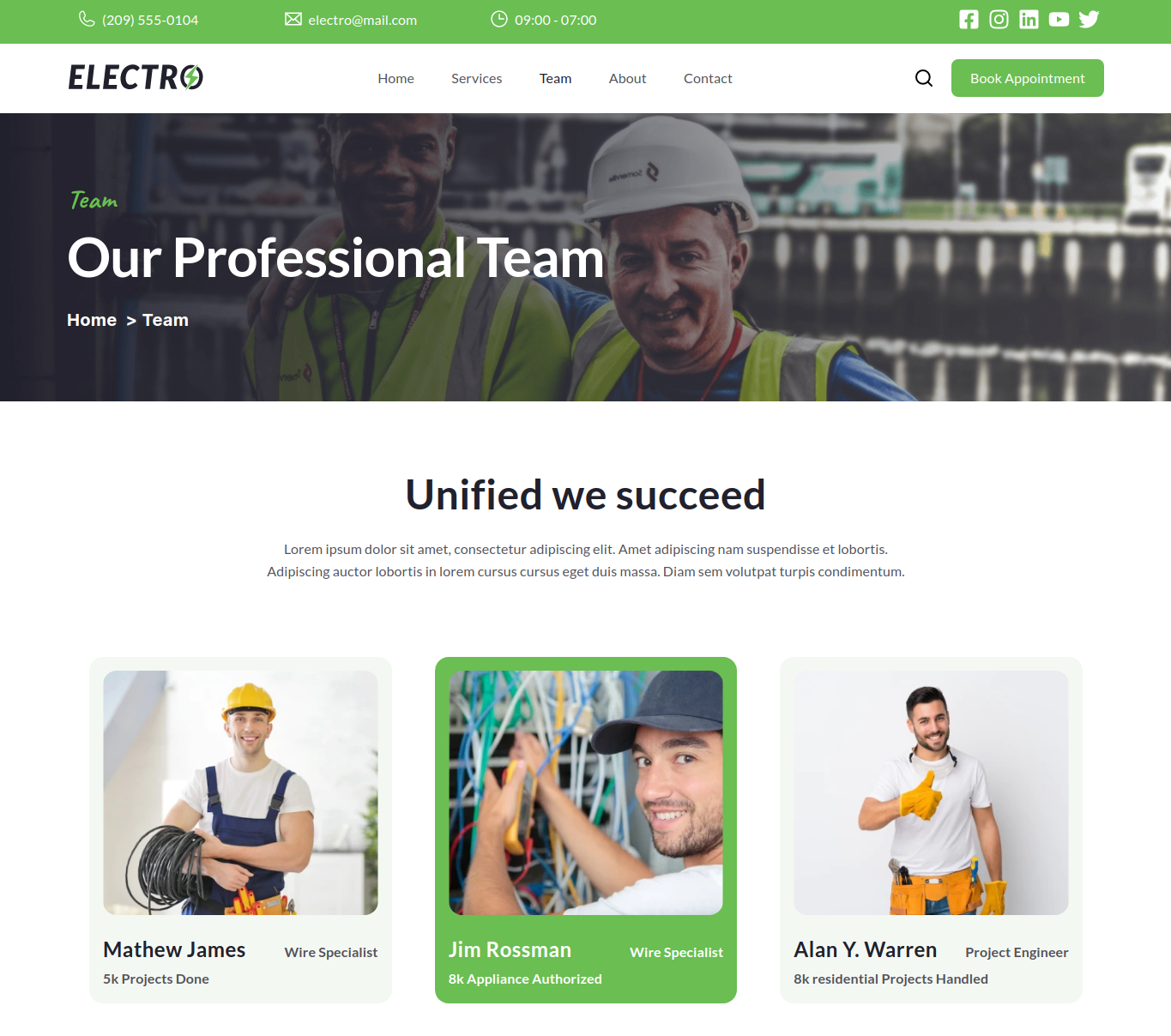
8.18.Team
If your team of electricians and engineers needs a highlight on your website page, you can use this module. You can set layout choices from a card, slider, or image, set column count, change the size of the image, add alt text, image loading and profile links, and designation of the team member.
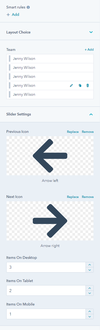
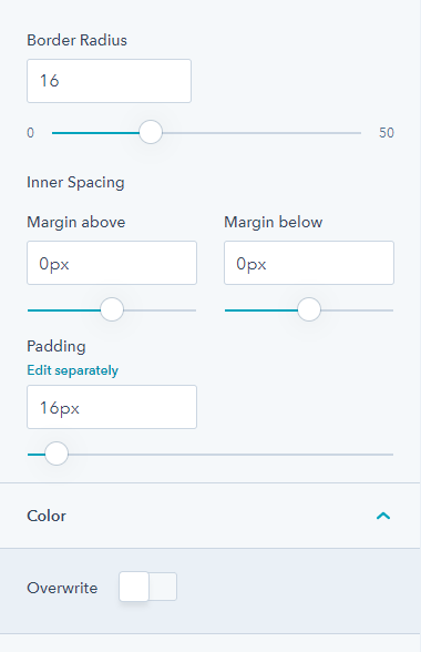
From its style tab, you can set image alignment, image corners, card background color, border-radius, and spacing.
8.19.Testimonial
The testimonial module can be used to display various testimonials on your landing page. You can add multiple testimonials, replace/remove profile images, alt text, maximum size, feedback text, and ratings.
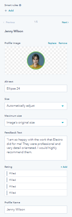
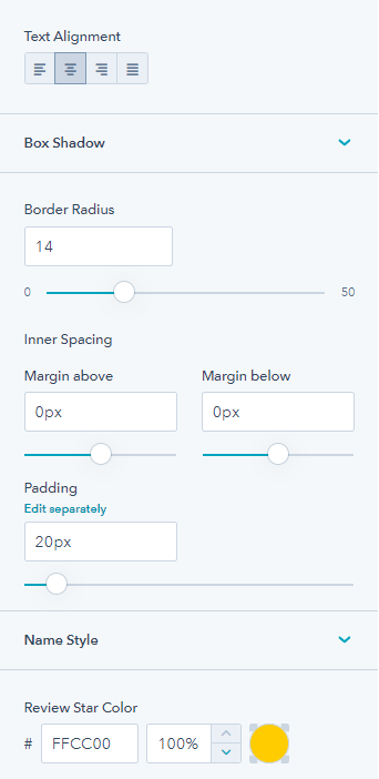
From its style tab you can edit text alignment, box shadow, border radius, inner spacing, padding, name style, and review star color.
8.20.Title Content
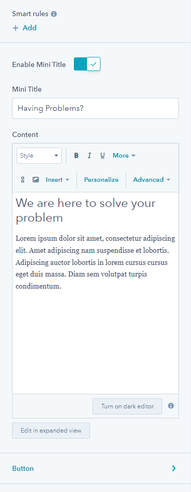
The title content module allows you to add a title on any page. There is an option to add a mini title, edit content, and add primary & secondary buttons.
From its style tab, you can edit the container, i.e background color, corner, enable maximum width, and content (desktop and mobile spacing & padding).
8.21.Video Popup
Using the video module, you can add a video to your website or landing pages. These are very easy to work with and increase the engagement rate of your page.
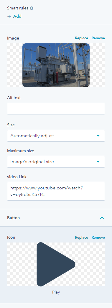
You can edit a video poster ( replace/remove a poster, alt text, poster size, maximum size), icon/content ( set icon over image or content over image), change the play icon and add the desired video link. From the style tab, you may enable overlay or overwrite icon color, and also set the corner radius of the video as seen by the visitors.
8.22.Blog Listing
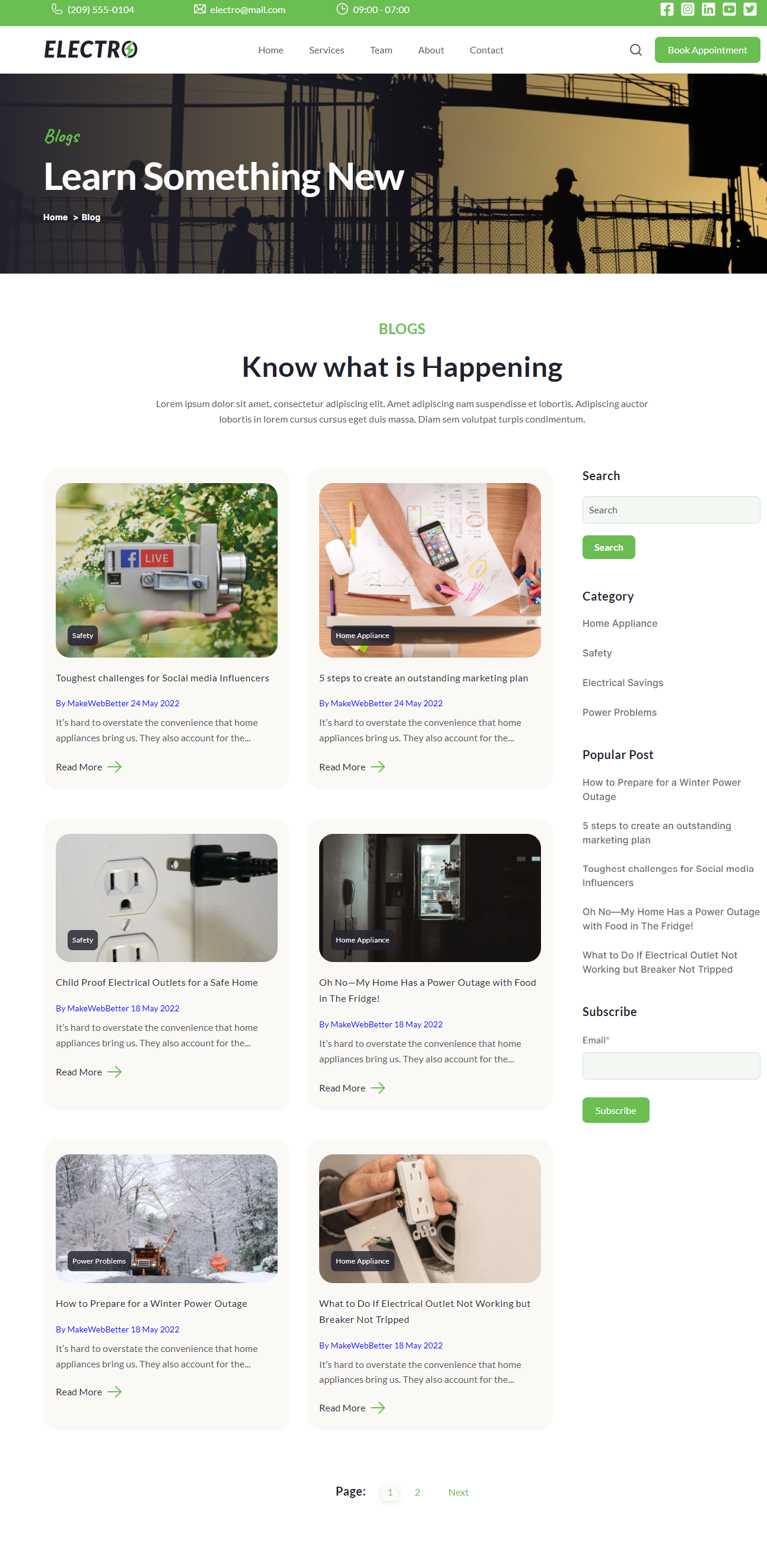
The use of the Electro blog listing template has already been explained above. The bog listing module enables listing blogs on your page. You can add the most popular blog posts or content pieces to your website pages. You can edit the content and style of the same.
Users can add mini titles, content, and blog meta description ( enable-feature image, tags, title, author, publish date, description, button, and edit button text)
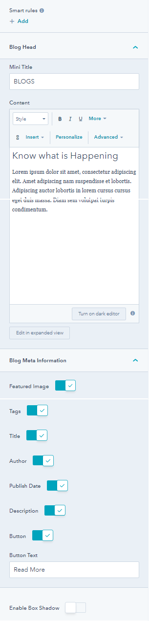
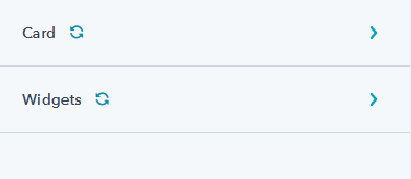
From its style tab you can make changes to the card ( card corners, feature image, background color, tags, title, author, date, description, buttons) and widgets ( title, category, popular posts).
8.23.Header Toggler
You can drag and drop the header above the menu component for best results. You can select an icon or image for the toggle open and close option.
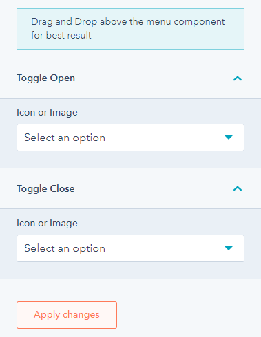
From the style tab of the header module, you can adjust spacing and padding.
8.24.Header Controls
The header control module allows the user to enable a search option, select the display mode of the language switcher (localized, PageLang, hybrid), and button type, link, and text on the website header.
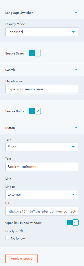
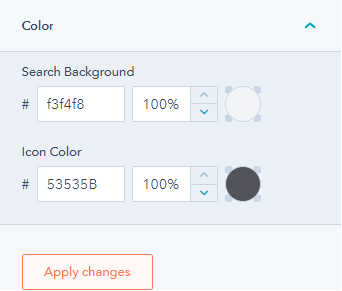
From the style tab, you can edit the search background color and icon color.
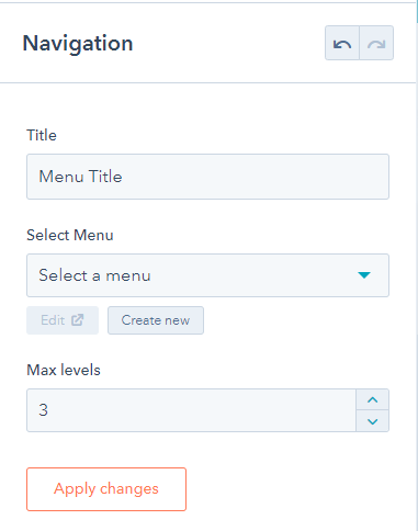
8.25.Navigation
The navigation module adds a navigation option for your visitors. You can edit the menu title. Select a menu or create and set maximum levels.
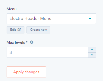
8.26.Menu
From the global editor menu, you can edit the menu option. Select Electro meu from the option and set maximum levels that determine the number of menu tree children that can be expanded in the menu.
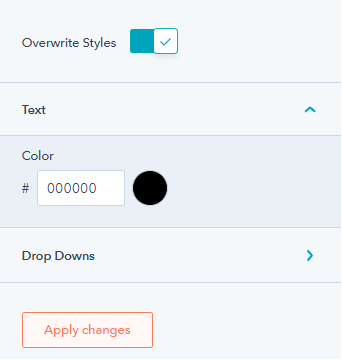
From the style tab, select to overwrite styles, change menu text color, and drop-down options.
9.Template Library
9.1.Homepage
9.2.About us
9.3.Contact Us
9.4.Services
9.5.Team
9.6.Make an Appointment

9.7.Blog Listing
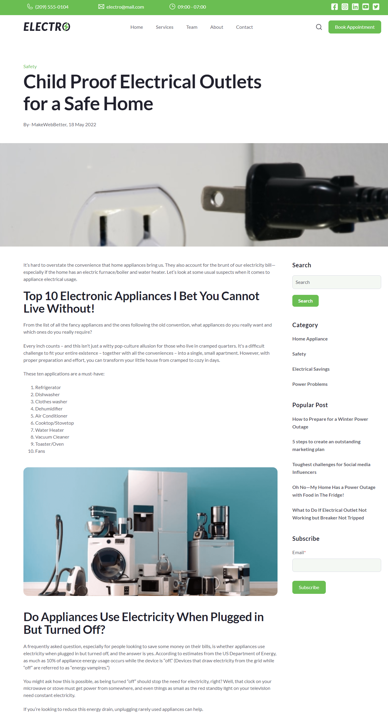
9.8.Blog Detail
10.System Pages
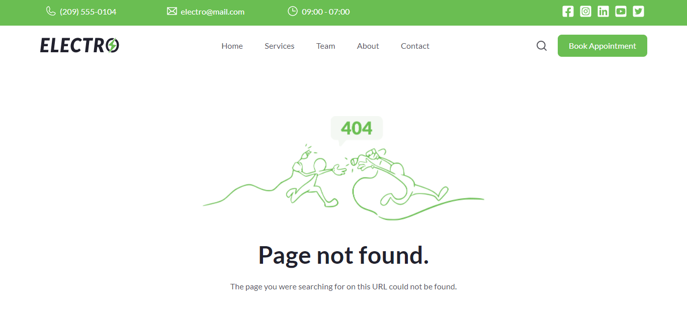
10.1.Error 404
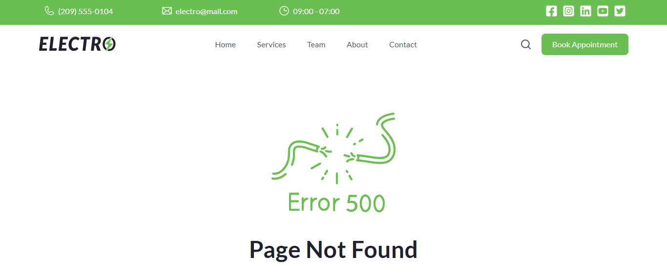
10.2.Error 500
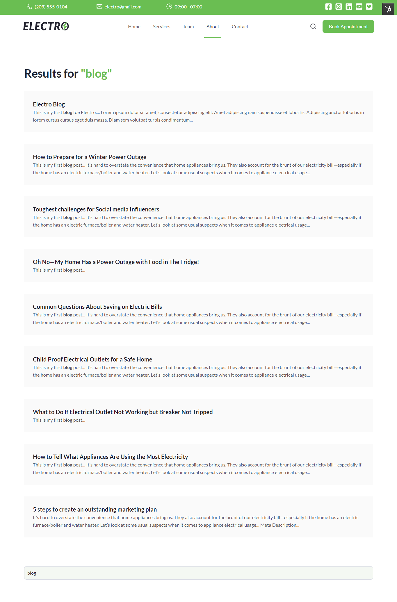
10.3.Search Results
10.4.Password Prompt Page
10.5.Email Backup Unsubscribe
10.6.Email Subscription Confirmation
10.7.Email Subscription Preferences
8.15.Social Follow
The social follow module allows you to add your social platforms like Twitter, Instagram, Facebook, and LinkedIn on your website pages, header, or footer.
You can replace/remove social icons, change icon size and icon color, and add your social links, and icons. From the style tab, you can enable background color, change border radius, and set desktop and mobile alignment.