
1.Overview
- Clean and Modern Look
- Multiple Creative Pages
- Multiple Module Layouts
- Modules – 26
- Sections – 9
- Templates – 6
- Blog – 2
- System Pages – 7
1.1.Edit Theme Settings
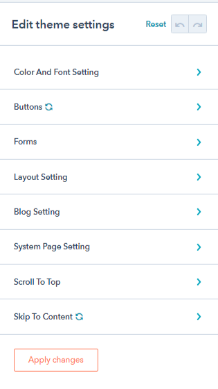
Through this setting, you can make global changes to your HubSpot theme. To navigate to the theme settings, create a page using the theme and in the left panel, click on Theme and then Edit Theme Settings.
You’ll find the following settings here:
1.1.1.Color And Font Setting
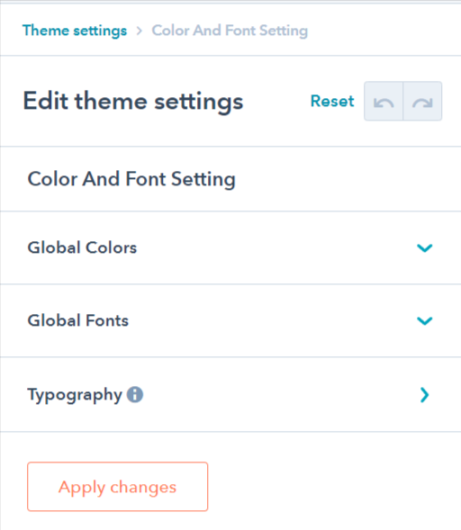
There are 3 sub-settings in this menu:
- Global Colors: This setting lets you configure Primary Color, Primary and Secondary Accent colors, Body Background color, and Heading Color through this setting.
- Global Fonts: This setting lets you change Heading font, Body font, Subheading font of the theme.
- Typography: This setting lets you tweak the headings from H1 to H6 along with Subscript, Superscript, Links and Blockquotes.
1.1.2.Buttons
There are 3 sub-settings in this section:
- Button: You can change the button font size, line height, and text transformation (uppercase, lowercase, capitalize), adjust button spacing and corner radius and set the color of the button animation border.
- Filled button: Set the style of the filled button, like changing the border text and background of the filled button in active, focussed, and hover states.
- Outlined button: Set the style of the outline button, like changing the border text and background color of the outlined button in active, hover or focus states.
1.1.3.Forms
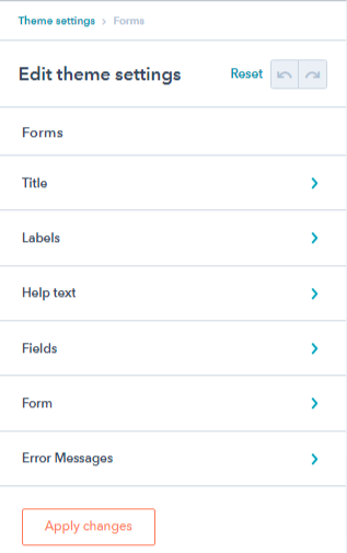
Under the form’s settings, there are six sub-settings:
- Title: Change title font, line height, letter spacing, and transform, change background color, adjust the spacing, change border style, and corner radius of the form title.
- Labels: Adjust label text font & color, line height, letter spacing, and label spacing.
- Help text: Text settings for help text like font, color, bold, underline, size, etc.
- Fields: Change placeholder color, inputs font, background color, spacing, border color, and width, and change border color on focus, and corner radius. You can also control the paragraph content of GDPR fields and control form rich text fields.
- Form: Change form background color, birder style, and spacing.
- Error messages: Change error messages text and spacing.
1.1.4.Layout Setting
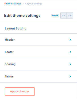 You’ll find the following settings here:
- Header: You can change settings of your Sticky Header, Header on top scroll, Header top and bottom bar, Background, Language switcher, Menu, Heading, Text and Icon color from here.
- Footer: This setting lets you tweak the Footer Background, Heading, Text and Menu.
- Spacing: You can change the settings of Container Width and Section Spacing from here.
- Tables: You’ll find settings for Table Header, Table Body, Table Footer, Table Cells in this section.
1.1.5.Blog Setting
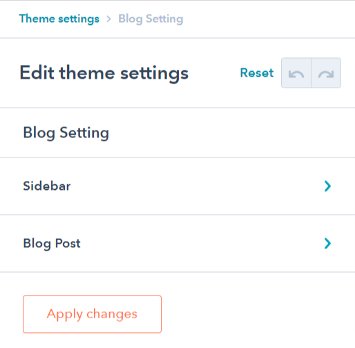
You can configure the blog post settings here. There are 2 settings in this section:
- Sidebar: Enable or disable the sidebar on blog from here.
- Blog Post: You can show/hide author name, image, timestamp, tags, and related posts from here.
1.1.6.System Page Setting
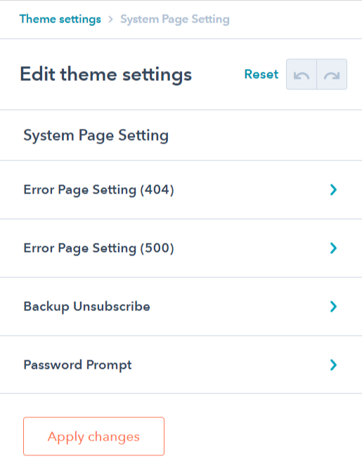
To make changes in system pages, you can use this setting. There are 4 settings here,
- Error Page Setting (404): Enable/disable the error image, and change the error banner image from here.
- Error Page Setting (500): Enable/disable the error image, and change the error banner image from here.
- Backup Unsubscribe: Enable/disable the banner image, and change the backup unsubscribe banner image from here.
- Password Prompt: Enable/disable the password prompt image, and change the password prompt banner from here.
1.1.7.Scroll To Top
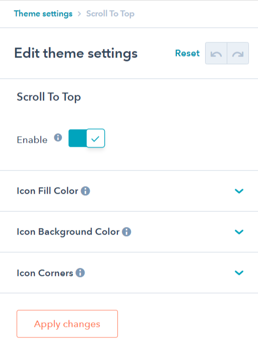
This section will let you Enable/Disable the scroll to top button element. Apart from it, there are 3 settings,
- Icon fill color: Change the color of the arrow inside the button.
- Icon background color: Change the background color of the icon.
- Icon corners: Adjust corner radius of the icon.
1.1.8.Skip To Content
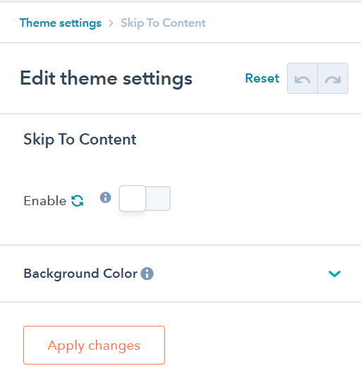
You can Enable/Disable the Skip to content button through this setting. Along with it, you can change the background color of the button from this setting.
2.Modules
Here’s the complete list of modules you get with this Food Pandora theme:
- Accordion
- Card
- Copyright
- Counter
- Custom Button
- Custom Form
- Custom Image
- Custom Menu
- Filter
- Footer Nav
- Gallery
- Header Toggler
- Header Controls
- Hero Layout
- Icon Box
- Logo
- Maps
- Our Partners
- Pricing Card
- Social Follow
- Spacer
- Tabs
- Testimonial
- Title Content
2.1.Accordion
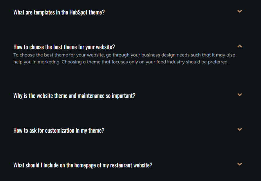
The accordion module can assist you in creating an area where users can toggle between showing and hiding FAQs or vast sections of text.
Under accordion, you have the settings to
- add multiple accordions on your landing pages and choose the icon position for accordions, i.e. either left or right.
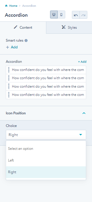
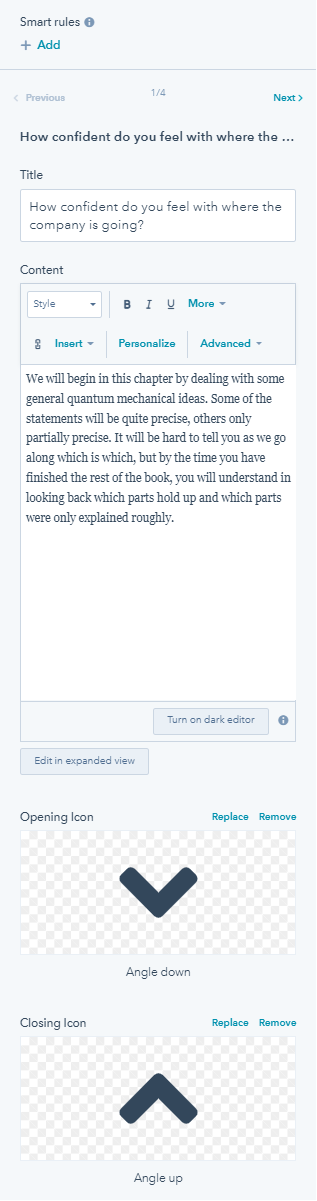
- For every accordion, you can edit its title and content. You can also replace or remove the opening and closing icon.
From the style tab, you can edit the following:
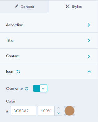
- Change accordion background color, spacing & padding, border radius, and enable box shadow.
- Overwrite font settings to change the color and font of the title. Also, adjust the title spacing and padding.
- Overwrite icon color.
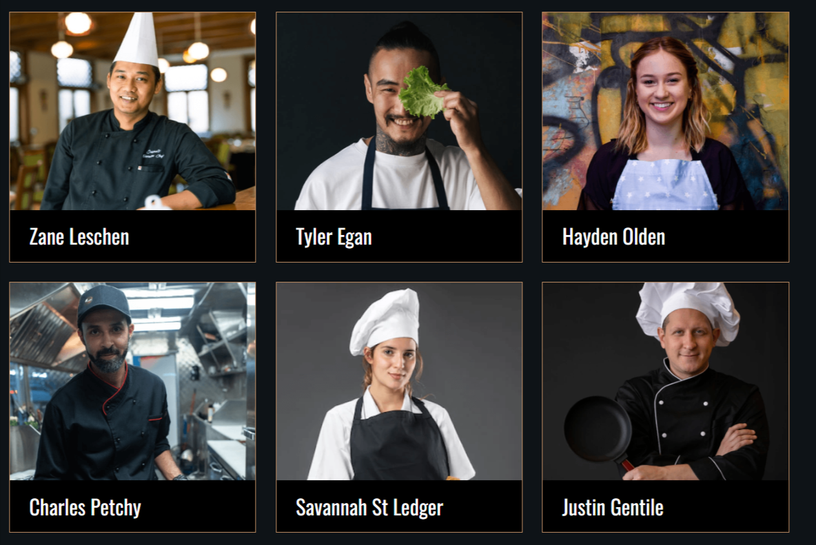
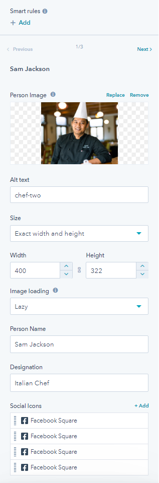
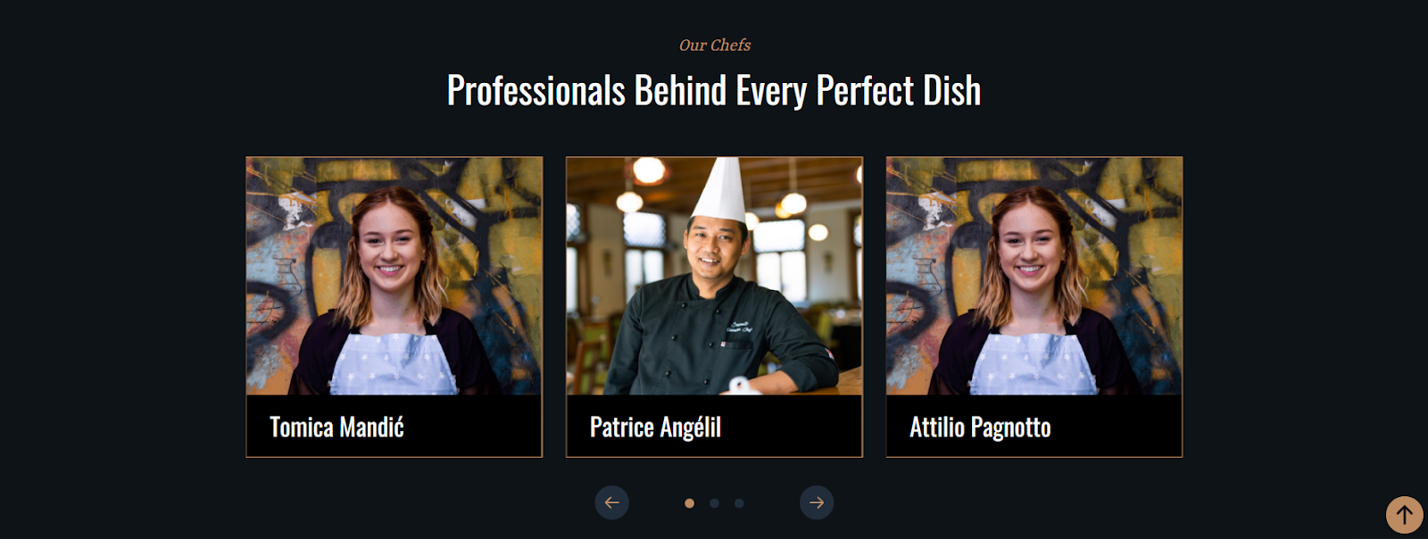
2.2.Card
You can use the card module for adding your chef’s image with a combination of content. Besides you can also use it to showcase features and promote products or services in creative and interactive ways.
In the cards module, you have the settings to:
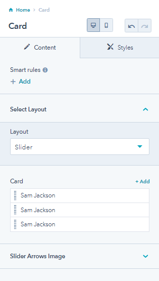
- Change the layout of the card module from slider or card.
2.2.1.Card Layout
2.2.2.Slider Layout
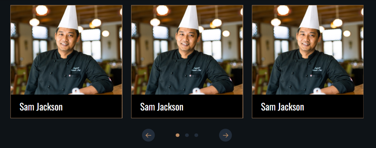
- Add multiple cards and edit them. You can replace or remove the person’s image. Make sure all images in the card are of the same dimension. Add alt text to the image, change the image size, width and height, select image loading, add a name, designation, and different social icons with links.
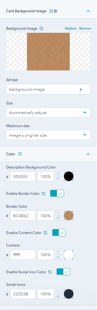
- From the style tab, you can change card background image, add alt text, size adjustments, set a maximum size, and overwrite color settings for description background color, border color, and content color. You can enable or disable the description background color, border color, content color and social icon color.
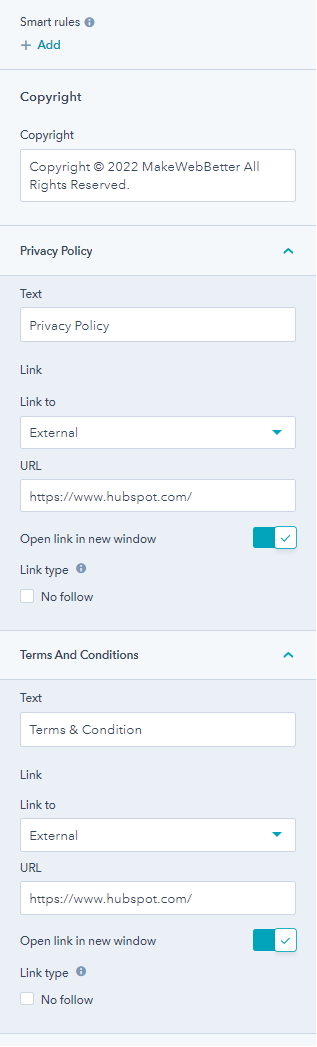
2.2.3.Copyright
The copyright module allows you to display your copyright along with the terms and conditions links.

It has options to edit copyright text, privacy policy text, and terms and conditions texts. Additionally, you can add external links URLs, to privacy policy and terms and conditons.
2.2.4.Counter
The Counter module adds multi-column section counters to your page. Numbers always attract so use this module for showing off your best numbers!
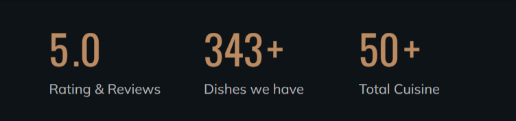
From the counter module, you can
- Change the column count to a maximum of 3
- Enable icon or image. Check to enable display of image in counter component.
- Enable counter text display condition.
- Change counter value, percentage, and counter text.
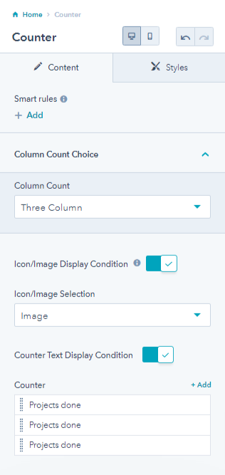
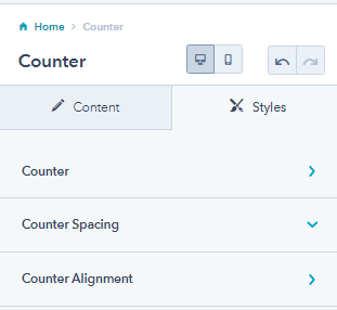
From its style tab, you can change counter value background color and font for mobile and font size and line height desktop, overwrite counter text settings(font, line height & font size), counter spacing and padding, and counter alignment for mobile and desktop.
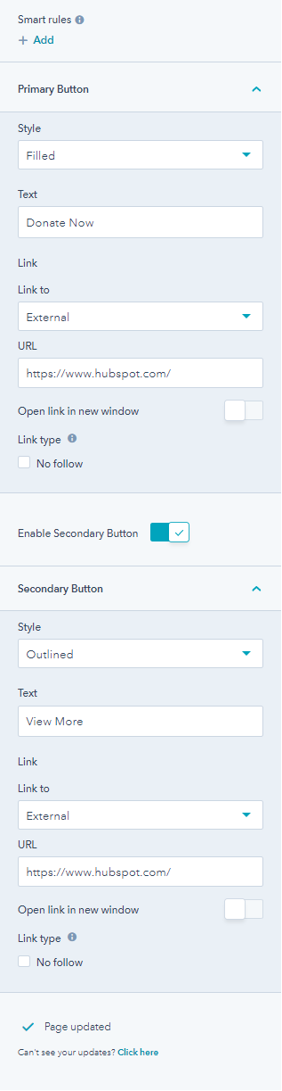
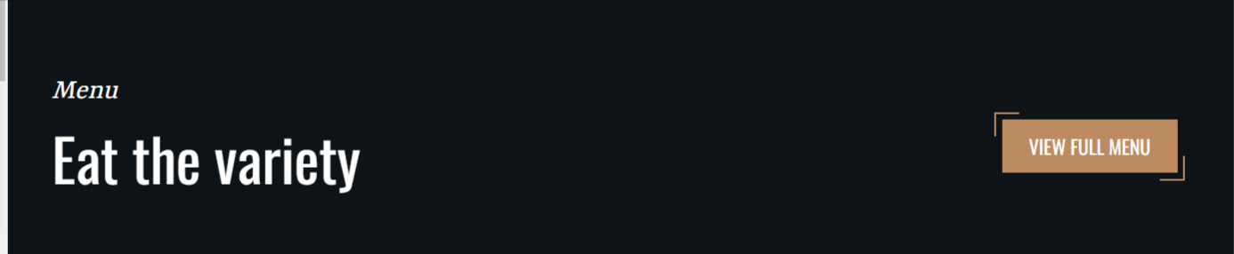
2.2.5.Custom Button
A custom button module is used for adding a clear call to action to your website pages. It enables the user to take immediate action. The following is an image of a primary and secondary button.

From the custom button module, you can select the button style (filled or outlined), edit button text, and add links to both the primary and secondary buttons. You can also enable or disable the secondary button anytime.
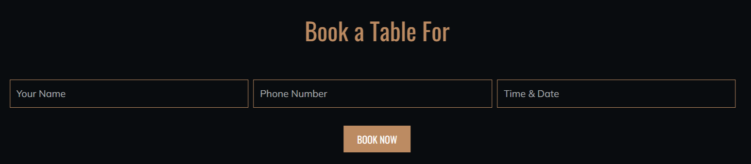
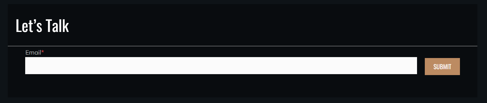
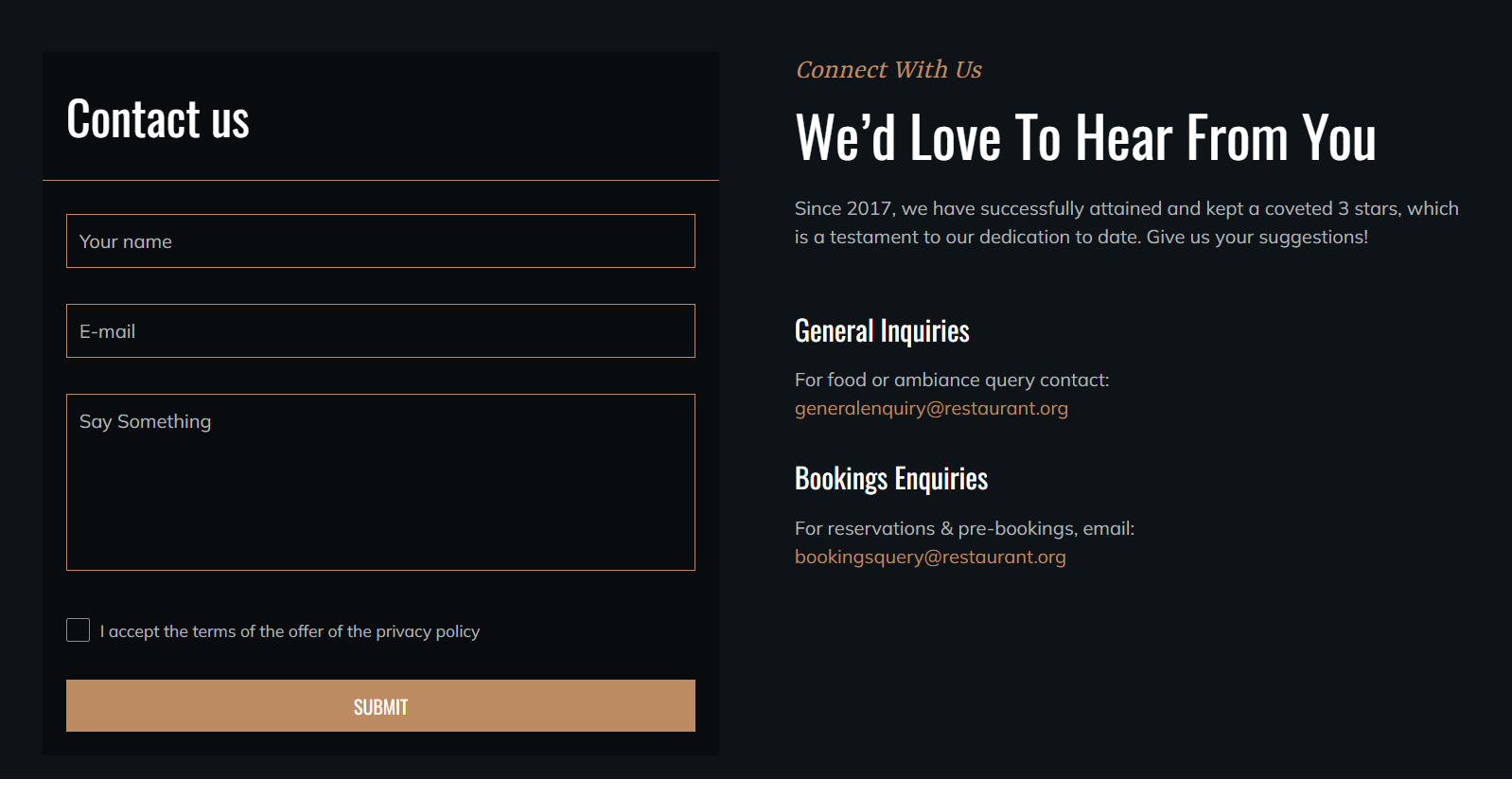
2.2.6.Custom Form
If you want to add a particular form to your website or landing page, you can use the custom form module.
From the custom module, you can
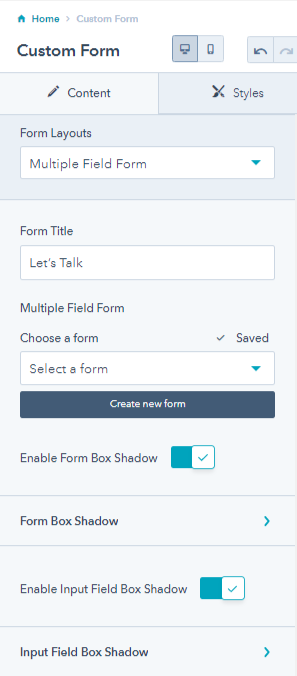
- Choose the form layout from the single field with a side button, multiple fields, and single field form with a button at the bottom.
1. Multiple field custom form
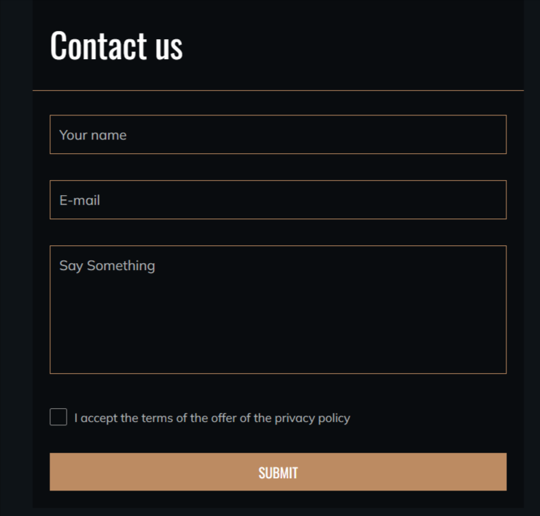
2. Custom form with button at the bottom
3. Single field with side button
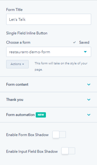
- Change the form title, choose a form from the existing forms or create a new one.
- Enable the form box shadow and input field box shadow. You can add or edit these shades further.
- Once you choose a form you can edit the form content, thank you text, edit button text, GDPR options or add a new field to the form.
From its style tab, you can
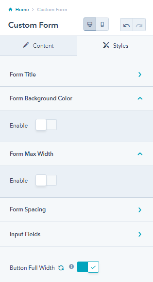
- Overwrite form title color, enable the application of border-bottom to the form title (change border width & border color), and change the desktop alignment for the form.
- Enable form background color and enable form max-width.
- Overwrite form spacing for desktop and mobile. You can edit the custom form spacing and padding for both mobile and desktop devices.
- Enable and change the form background color, enable to disable the global border on input fields, and enable the fullwidth of the button.
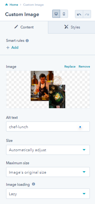
2.2.7.Custom Image
The custom image module allows adding a single custom image to your landing or website pages. You can couple it with some other module to give it a finished look!

The custom image settings include adding alt-text to the image, adjusting the size, setting the maximum size, and image loading. You can remove or replace the image anytime.
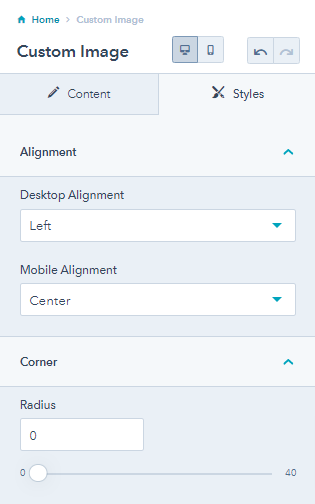
From its style tab, you can change the desktop and mobile image alignment and set the image corner radius.
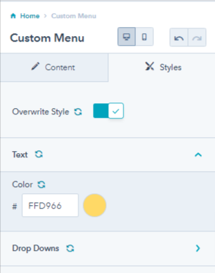
2.2.8.Custom Menu
You can add a custom menu to your landing page using this module. You can choose the menu you want to apply on your header or footer.
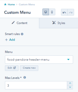
From the style tab, you can overwrite style, change text color, and drop-down text color.
2.2.9.Filter
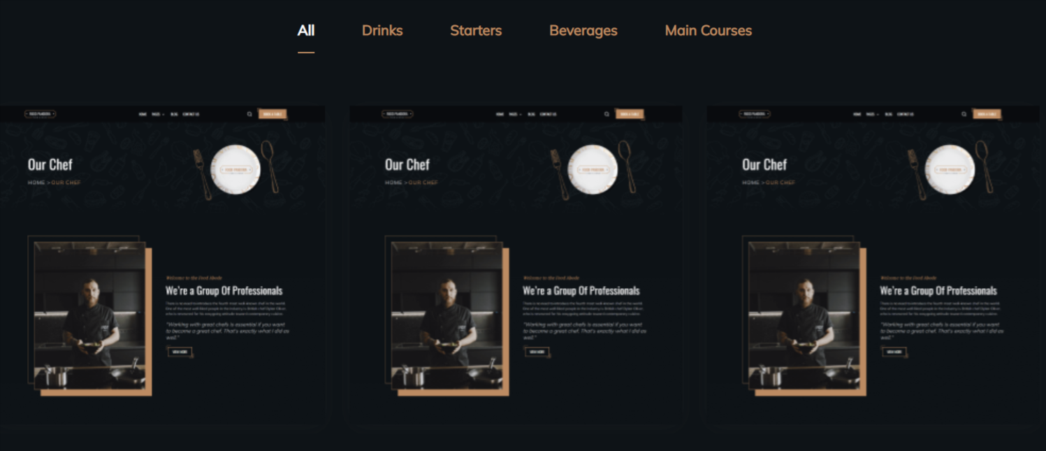
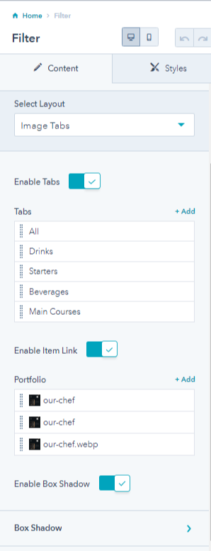
The filter module allows you to add filtering ability for the users. Your website visitors can filter certain products, dishes, or service pages based on their choices.
From its module settings, you can
-
- Select layouts from image tables and image sliders.
- Enable or disable tabs, add multiple tabs, edit each tab name, name tab id, and set the tab as an initial filter. In that case, this tab will be applied by default when the user visits that page.
- Enable or disable item links, and add multiple portfolio tabs.
- Edit portfolio tabs by replacing or removing images, adding alt text, decide image loading, set items ID, and item link URL.
- Enable box shadow and adding box shades
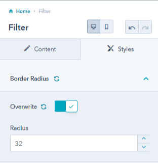
 From its style tab, you can overwrite the border radius.
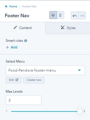
2.2.10.Footer Nav
Using this module, you can add a navigation on the footer of your website pages.

You can select a menu for displaying on your navigation and choose a maximum level for the same.
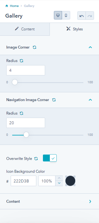
2.2.11.Gallery
As the name suggests, you can add a gallery of images to your website pages using the gallery module. You must have your restaurants images that you want to display on your website and take lesser space too. Gallery module works best where image module is too less for your landing page!
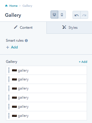
You can add as many images as you like to the gallery and edit each image too.
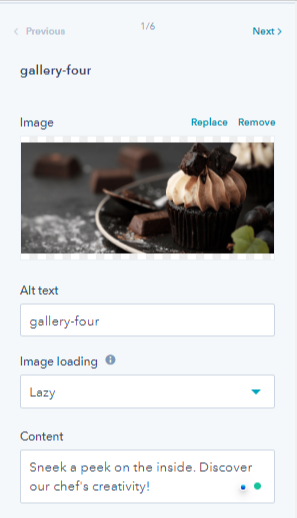
From its style tab, you can edit the image corner radius, navigation image corner radius, overwrite icon background color, and change the content text and background color on the gallery images.
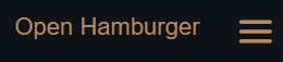
2.2.12.Header Toggler
The header toggler allows you to add a toggler to the header so that user can see more options.
You can edit the style of the header toggler by changing the open and close icon color, and the spacing and padding of the toggler.

For best results you should drag and drop this odule above the menu component.
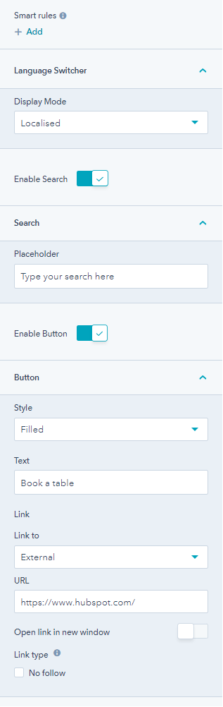
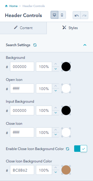
2.2.13.Header Controls
Header controls include choosing the display mode, enable search, change placeholder text enable button on header, select button style, edit button text, and add a link to the button.
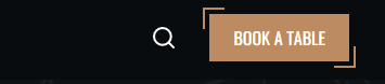
From the style tab, you can change search background color, open icon color, input background color, close icon color, enable or disable close icon background color and change the close icon background color.
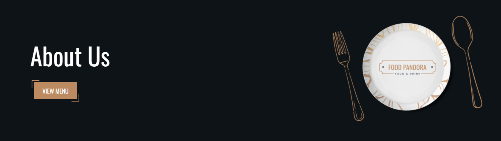
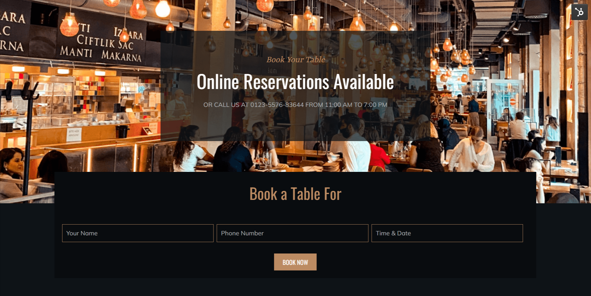
2.2.14.Hero Layout
The hero layout is the top most banner and the first thing the users views as soon as they land on your website page. You can edit the hero layout with the following,
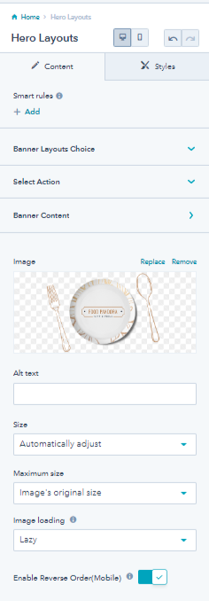
- Change the banner layouts. You have three options.
1. Banner with image
 2. Background image
3. Background color

You can select actions from breadcrumb or button.
- Breadcrumbs action
- Button action

You can edit the banner content, enable a mini title, add a primary CTA button and change its style. Additionally, you can edit breadcrumbs by adding parent data, change the current page name, enable banner overlay, it’s direction value, add shades and change it’s default color.
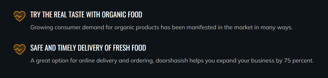
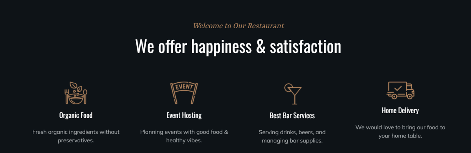
2.2.15.Icon Box
This module provides an area where you can display several cards. For example, you could show the available services, cuisines, or regular events of your restaurants along with icons.
You can add multiple cards, change card layout, choose the number of columns, select use of icon or image, and edit icon box content, image loading, replace remove the icon/image, add alt text,etc.
1. Icon box with card layout
2. Icon box with compact layout
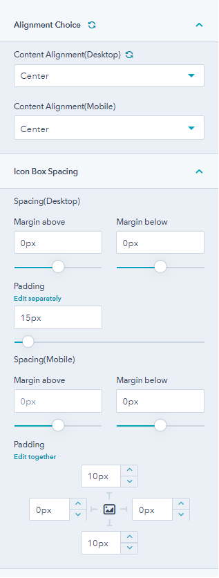
From the icon style tab you can change icon box alignment for mobile and desktop, and change the spacing and padding.
2.2.16.Logo
You may add your restaurant’s logo anywhere you like with this module.
You can further replace or remove your custom logo, adjust maximum size of the logo.
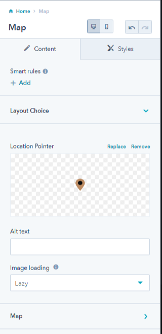
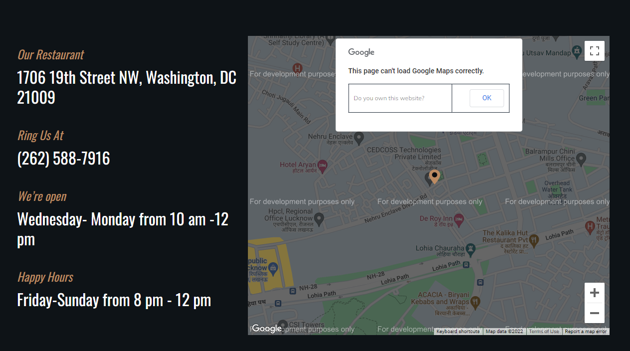
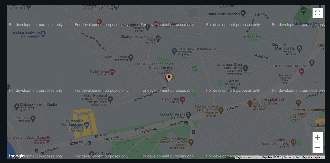
2.2.17.Maps
Map module adds your location in the form of a map on your website page. In this way people will easily find your restaurant via a map.
You can change the layout based on single or multiple locations, replace or remove pointer icon/image, change the location pointer, adjust image loading, input map API, pointer details, Map JSON file, map zoom level, center latitude, and longitude.
1. Single Location Map Layout
2. Multiple Location Map Layout
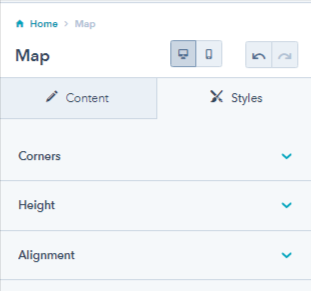
From it’s style tab you can overwrite border radius corners
2.2.18.Our Partners
Our partner module helps you to add your partners in an icon or image form on your website pages. It can be used for add your partners in getting your restaurants moving lik your delivery partner, fresh food partners, etc.
You have the layout choice where you can add these partner modules in the form of listings or slider, add multiple partners, edit the content of the partner icon, and enable or disable description for partners.
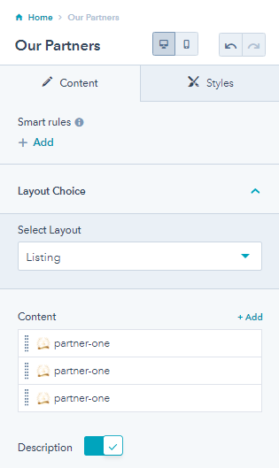
1. Partner module without description

2. Partner module with description

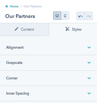
From its style tab, you can change the module alignment, enable or disable grayscale, overwrite corner radius settings, and adjust the inner spacing of the module.
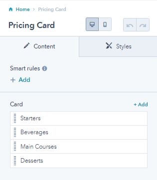
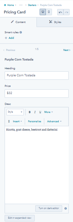
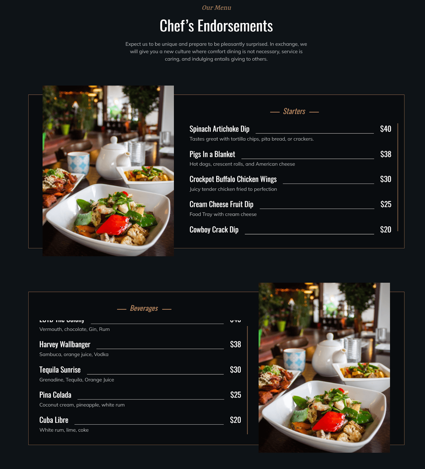
2.2.19.Pricing Card
Pricing cards allow adding your dishes along with their prices. Just like you have a menu for you physical stores, you can use the pricing card for adding a digital menu to your website pages.
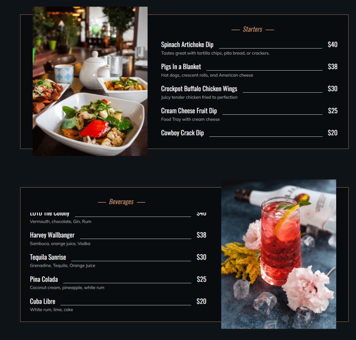
You can add multiple sections like welcome drinks, starters, desserts, main course, etc. and edit their content.
For each card you can replace or remove the card image, add alt text, change card titles, mention multiple items under each card, and enable the reverse effect. The reverse effect changes the image from the right side of the content to the left side and vice versa. Additionally, you can only use 420 x 550 dimension images for the pricing card.
For items in each card, you can change the headings, and prices and add a description for the same.
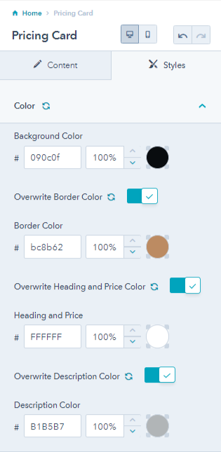
The style tab of the pricing card module helps you overwrite color settings like changing pricing cards’ background color, border color, price, and heading, and description colors.
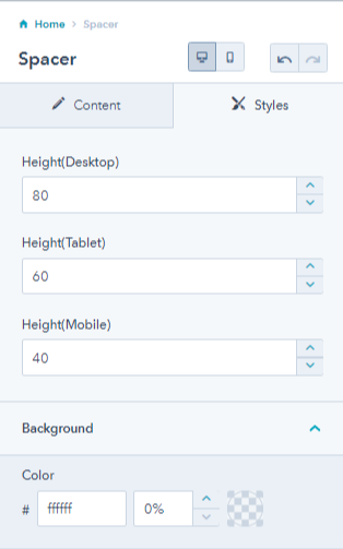
2.2.21.Spacer
The spacer module adds white space to the website and landing pages. With the spacer module, you can add vertical spaces between sections and modules as and when required.
For spacer module you can have styling options to change the spacer height for desktop, tablet, and mobile. You can also change the spacer background color.
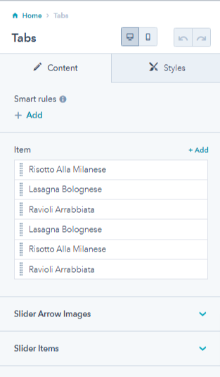
2.2.22.Tabs
Create single consecutive windows to show your famous dishes on your homepage or landing pages
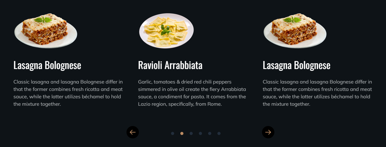
You can add multiple items in the tabs and edit them too. You can replace or remove the icon of next and previous arrow, add alt text, and change the number of slider items for desktop, mobile and tablet.
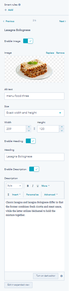
For editing each iten you can enable or disable image, add alt text, select image size, width, and height, enable or disable heading, edit heading, and add a description.
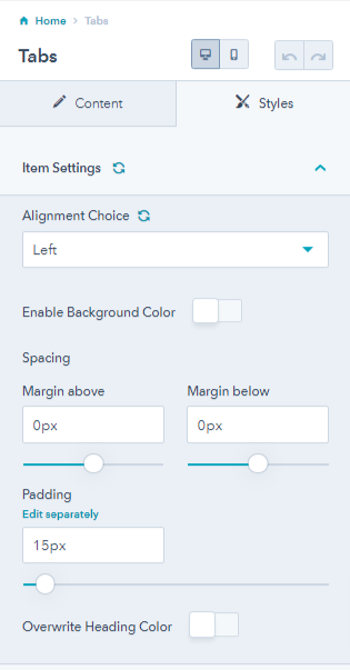
From its style tab, you can change tab alignment, enable background color, adjust spacing.
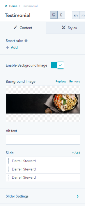
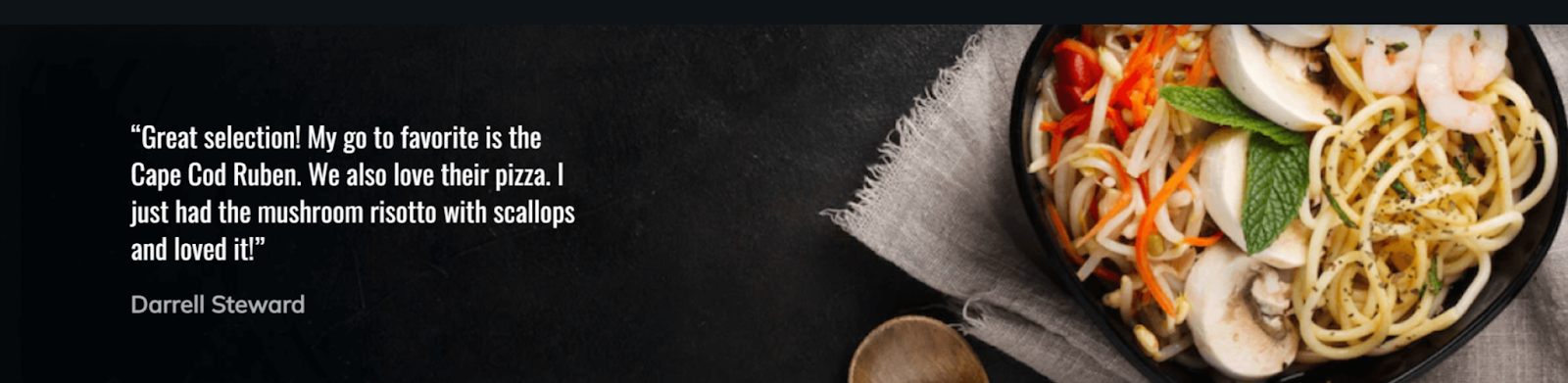
2.2.23.Testimonial
Testimonials are a great way to win the customers trust. If people love you your food and service, you can always show them off with the testimonial module. It allows you to add their statements on your website pages.
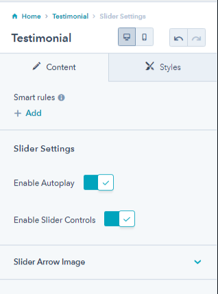
You can replace or remove background image from the testimonial content, add alt text, add multiple slides, and adjust a few slider settings.
Slider settings allow you to enable testimonial autoplay or enable slider control for the user to see more testimonials. You can also remove or replace the slider arrow images.
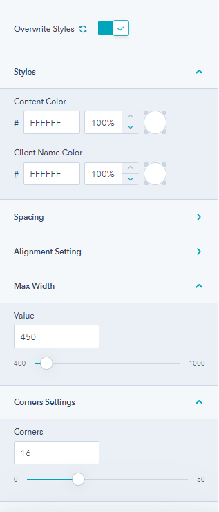
From its style tab, you can change the content color, client name color, change spacing, set alignments, and adjust the maximum width along with the corner radius.
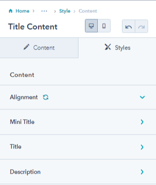
2.2.24.Title Content
The title content module allows adding title text on your landing pages.
You can enable or disable a mini title, edit mini title text, and add content.

You can also enable a primary and secondary button along with the title content. You can further change the button styles for both the buttons.
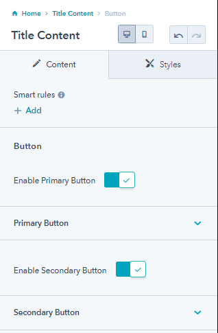
From the style tab you can make changes in the container color, enable maximum width, and change desktop and mobile container spacing and content.
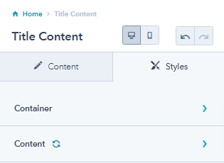
From the content setting of the style tab, you can adjust the text alignment for desktop and mobile, overwrite title, mini title, and description settings.
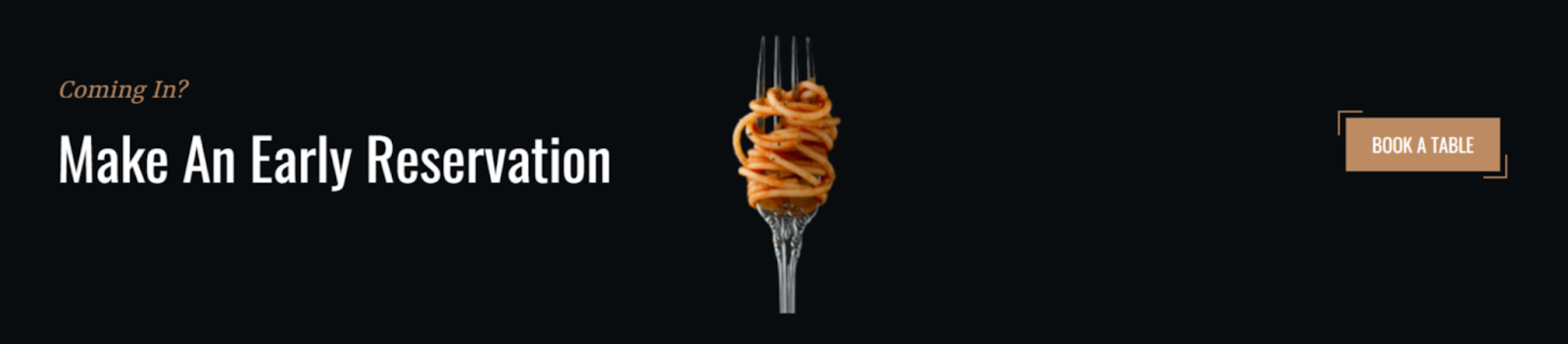
3.Theme Sections
This free HubSpot theme offers 9 different sections you can use on any page of your website.
-
Button with text
-
Counter

-
Form landing banner

-
Form with content
-
Get in touch
-
Icon box
-
Our team
-
Pricing
- Testimonial
4.Theme Templates
This Food Pandora theme comes with 6 following templates,
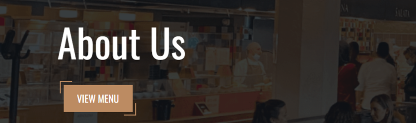
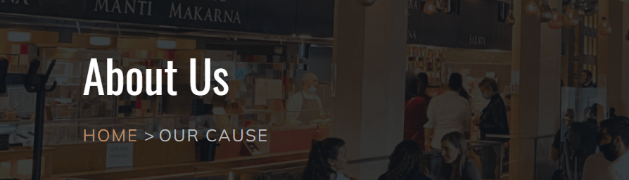
- About Us
- Contact
- Food Menu
- Homepage
- Landing Page
- Our Chef
5.System Pages
Food Pandora theme offers you 7 different system pages that are as follows,
- 404 Error
- 500 Error
- Password Prompt
- Search Results
- Backup Unsubscribe
- Subscription Preferences
- Subscription Confirmation
2.2.20.Social Follow
Your restaurant/cafe/food business must have a social media account. Hence the social follow module enables you to display all your social media accounts on your website pages. You can pair your social follow module with the logo and place it on your header or footer for best results.
You can add multiple social icons like Facebook, Instagram, Linkedin, Youtube, Twitter, etc.
You can replace or remove each social icons image, and add your social link.
From its style tab you can change the social follow fill color, adjust the corner radius, and change its desktop andmobile alignment.