1.Overview
- Beauty dedicated landing page, homepage & product page templates.
- Search engine-optimized landing pages.
- Create best spa website pages with appointments, testimonials & pricing HubSpot templates.
- Lightweight, high-speed DIY HubSpot theme best for CMS beginners.
- Codeless drag and drop HubSpot beauty & cosmetic theme with best modules.
- Highly customizable HubSpot theme with flexible bandwidth
1.1.Getting Started
We bring you continuous updates with our premium HubSpot themes, so you stay updated on your online font. Glambiz has multiple HubSpot website pages and landing page templates that help you in getting started with creating highly interactive & converting pages for your inbound website.
This documentation gives you an idea about working with HubSpot themes. Go through the documentation carefully as it helps you to configure modules and sections on your HubSpot CMS.
You can request for a free demo of our → Glambiz Demo to see how well it suits your interest. Additionally, we’re certified HubSpot developers. So, we’ll customize this theme perfect for your beauty website according to your needs.
1.1.1.Purchase HubSpot Theme
For purchasing the Glambiz HubSpot theme, you can directly navigate to the HubSpot theme marketplace from your HubSpot portal. HubSpot theme marketplace allows you to download free themes and buy premium HubSpot templates from different HubSpot-approved agencies.
- Log in to your HubSpot portal > Click on Marketplace icon > Select asset marketplace > insert ‘Glambiz’ in the search portal > Click Buy button on the upper right > insert your email address > fill in your billing information > Click Payment Info
HubSpot marketplace accepts payments via credit cards and the preferred payment gateway is Stripe or Paypal. After your transaction is processed and completed, the Glambiz theme assets are added to your HubSpot design manager.
The templates and modules will appear for use in your HubSpot content under the same name as mentioned on the theme listing page.
1.1.2.Install Theme
After you purchase the theme, you need to install it and set it as your active HubSpot CMS theme.
1.1.3.Create a child Theme
We highly recommend you create a child theme of the Glambiz beauty & cosmetic HubSpot theme. As soon as you buy the theme HubSpot will prompt you to start editing the page templates of the CMS theme. However, before rushing into starting your newly designed pages, consider creating a child theme.
Please Note
Setting up a child theme preserves the ability of the updates to be applied to the parent theme. This way you can customize the child theme on your portal as much as you want without affecting parent theme styles.
Once the theme has been purchased, you can build up to 5 child themes with separate branding under the same account. Users of CMS Hub Enterprise can set up as many as 10 child themes.
1.1.3.1. Steps To Create a Child Theme
- Open your HubSpot account > navigate to marketing > choose files and templates > select design tools
- Find the @marketplace folder for the Glambiz theme > right-click on the Glambiz theme folder > select create child theme > name the child theme
- If you want to change the child theme location, do so by clicking change in the File location section. Select a folder > click select.
1.1.2.Theme Settings
For making changes in the look and feel of your cosmetic & beauty HubSpot CMS website, you can directly edit the theme settings. These settings are a centralized location to make changes that reflect all over your website and landing pages.
Read More: How To Change Global Styles in HubSpot Theme?
1.1.2.1.Access Theme Settings
You can access the theme settings on the Glambiz theme in two ways:
- Settings → Website → Themes → Glambiz child theme ( In case you’re just getting started and haven’t yet created any pages access the theme setting from the settings option)
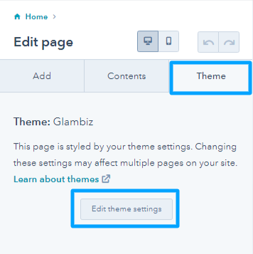
- Marketing → Landing Pages → Page Editor → Theme → Edit Theme Settings
Check out the theme settings added in the Glambiz Theme.
1.1.2.1.1.Colors
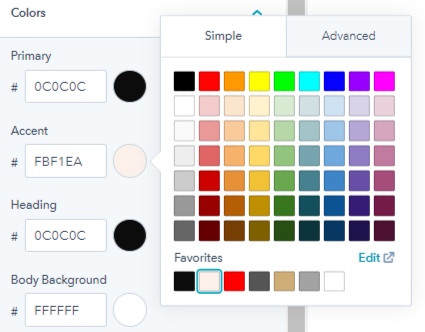
From the colors option of edit theme settings, you can change the global display of colors on your website. You must have a brand that follows a particular color scheme. This is the place where you can experiment and decide on your brand colors.
- Primary colors are a very important part of color theory. Red, yellow & blue are highly preferred primary colors. You can choose from the color palette provided.
- Accent colors make certain sections louder and different than others. These usually complement the primary colors.
- Heading colors that will show up on different headings on your website pages like h1,h2,h3, etc.
- Body background colors are added behind the elements as backgrounds. The white body background color is highly recommended.
- Link colors appear as you see the hyperlinked text on your landing pages.
- Links hover color is visible when you hover over a hypertext. Basically, the hover link color is visible only if the user will hover over the text.
1.1.2.1.2.Font
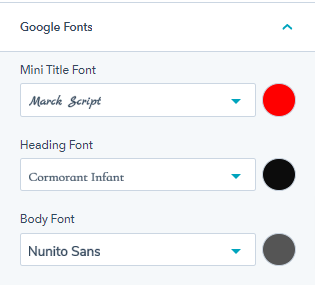
Fonts are different types of writing styles. It helps you separate headlines and content just by looking at them. There are more than 100 fonts than can be used on your HubSpot CMS website. With glambiz you can choose between google fonts or external fonts.
Besides, you can select different fonts for mini titles, headings, and body along with their colors.
1.1.2.1.3.Typography
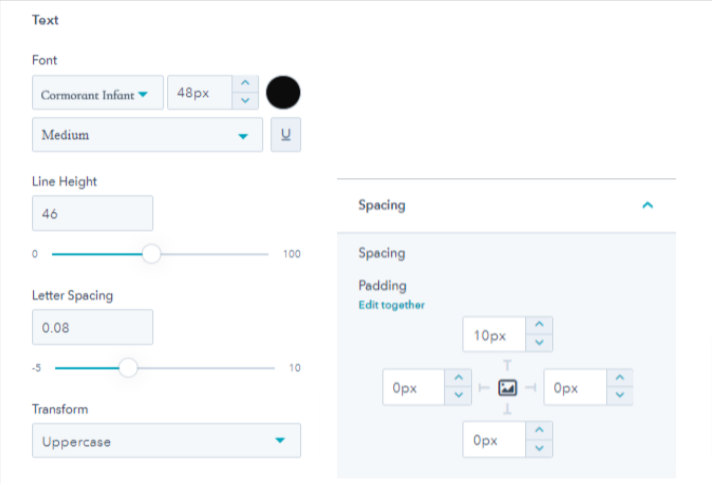
You can arrange the letters of the text in such a fashion that the user can read it clearly and find it visually appealing. Colors and fonts are one way to make it so. However, typography on your website also involves selecting fonts, adjusting letter spacing, and line height for desktops, mobiles, and tabs. These settings will be added over to the h1,h2,h3,h4,h5,h6, body, mini title, etc.
1.1.2.1.4.Buttons
Buttons are a crucial element on your website landing pages. For users, it is an action point. You need to make buttons highly convertible. We have added buttons in different sections so you don’t have to worry.
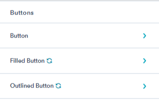
We have added a dark and light variant of outlined and filled buttons. From the buttons option of the theme settings, you can edit the font text & color, and change the background & border color for various states of buttons like active, hover & normal.
1.1.2.1.6.Forms
Forms are essential for the collection of customer data. Big or small, your food business benefits highly from this collected data. While using forms on the Glambiz theme, you can edit the title, background, border style, and corner radius for various form elements like title, help text, form fields, labels, error messages, etc.
1.1.2.1.8.Blog Settings
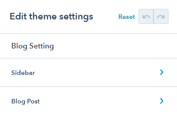
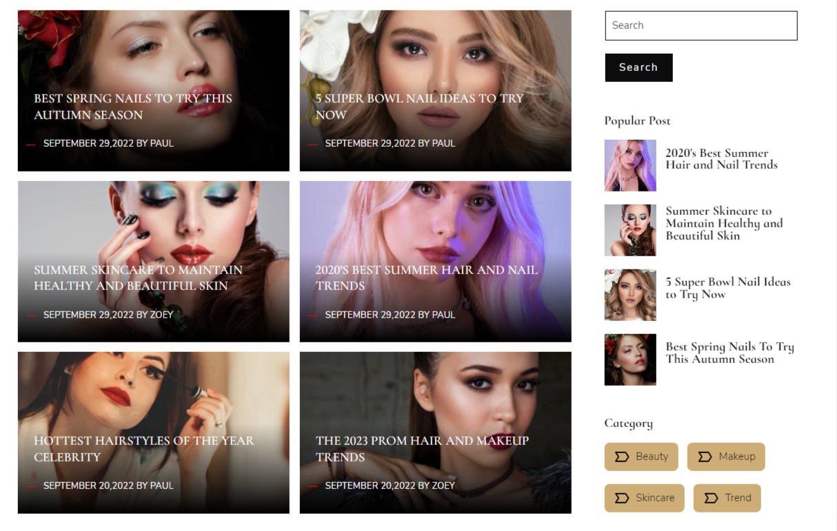
Certain global settings on your blog page can change the user experience considerably. You can enable and edit the blog sidebar. Some sidebar widgets includes search, topics, and popular posts. Enabling or disabling them is under your control.
The blog post option is generally for changing settings on the blog page. You can change the blockquote border & text color and enable or disable either of these anytime:
- Author name
- Timestamp
- Tags
- Related posts
- Comment form
1.1.2.1.9.Website Header
Website header options from the theme settings let you change a series of stuff like selecting header type from static or drag and drop, changing the menu background color, header background color, menu container background, and menu item border color.
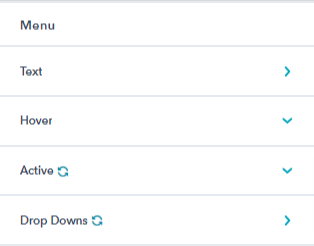
The header menu is also editable. While you will find additional settings on the header module. But, from the theme settings, you can change the menu items text font type and font color.
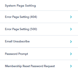
1.1.2.1.11.System Page Settings
System pages are automatically displayed pages that carry out common tasks like event registration and login. By placing modules on the page or editing already-existing content, system pages can be made more unique.
From the theme settings, you can change the general look of the system pages. For example, for every system page present on your website you can enable or disable its error image, remove or replace the same, edit alt text, and change the image loading style from browser default, eager, or lazy.
Note: “Lazy” loading defers loading this element until it’s visible on the page. This may help improve site performance. “Eager” loading loads the element right away.
1.1.2.3.Customizing Header
As you must have read above, theme settings have options to make changes in the header and header menu. However, there are certain modules that you can add and make navigation on your website easier via header.
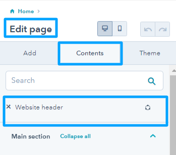
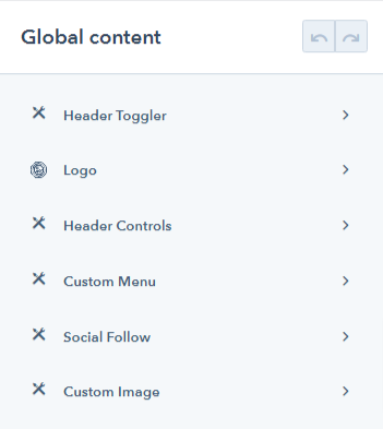
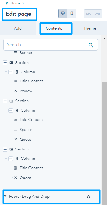
- From the edit page menu > go to content tab > website header > click on it > select open in global content edit.
All used global content modules will appear on this page. We have used, a header toggler, logo, header controls, custom menu, social follow, and custom image in our website pages template. Simply select the global content module one by one and edit its settings accordingly.
1.1.2.5.Modules Overview
The Glambiz beauty, spa, and cosmetic HubSpot theme has 43 highly customizable drag-and-drop modules. You can experiment with any module the way you like. Each module has styling options too. Keep reading to find out about each module.
Read more: What are HubSpot modules & templates?
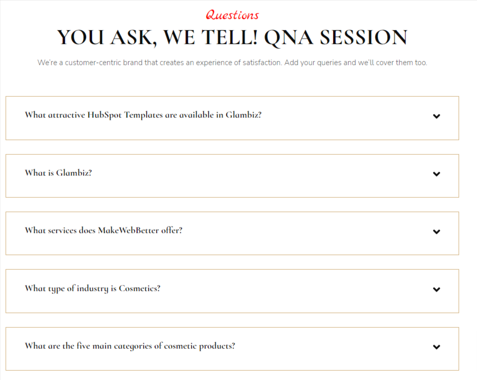
1.1.2.5.1.Accordion
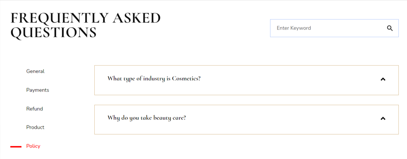
To show vast sections of text like displaying content in form of questions and answers, you can use the accordion module. You can edit the accordion module as you wish like modifying the heading & background colors, borders and shadows, adjust height for different devices, etc.
There are two accordion layout:
(a) Vertical tab
(b) Single column
1.1.2.5.3.Banner
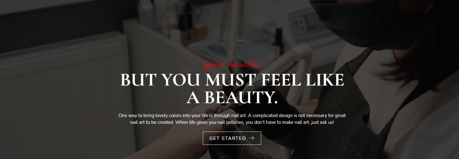
The first thing that the users notice when they land at your website page. You can use it on your home page or about us page to inform the visitors about your marketing or other services. You can select the layout you want from the different options available. Make the most of it’s style tab settings.
Three banner layouts you can choose from are:
(a) Banner with image
(b) Background image
(c) Background color
1.1.2.5.4.Banner Slider
This module is similar to the banner. It is a visual display that you may employ to encourage immediate interaction with website visitors.
They are now very popular in eCommerce companies and are mostly used to advertise campaigns like sales and buying opportunities that would otherwise have to be looked for or found by accident. It has two layouts you can choose from:
(a) Image slider
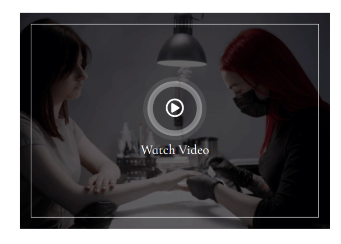
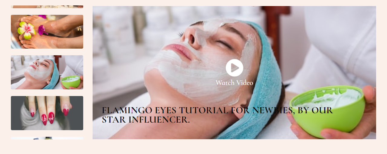
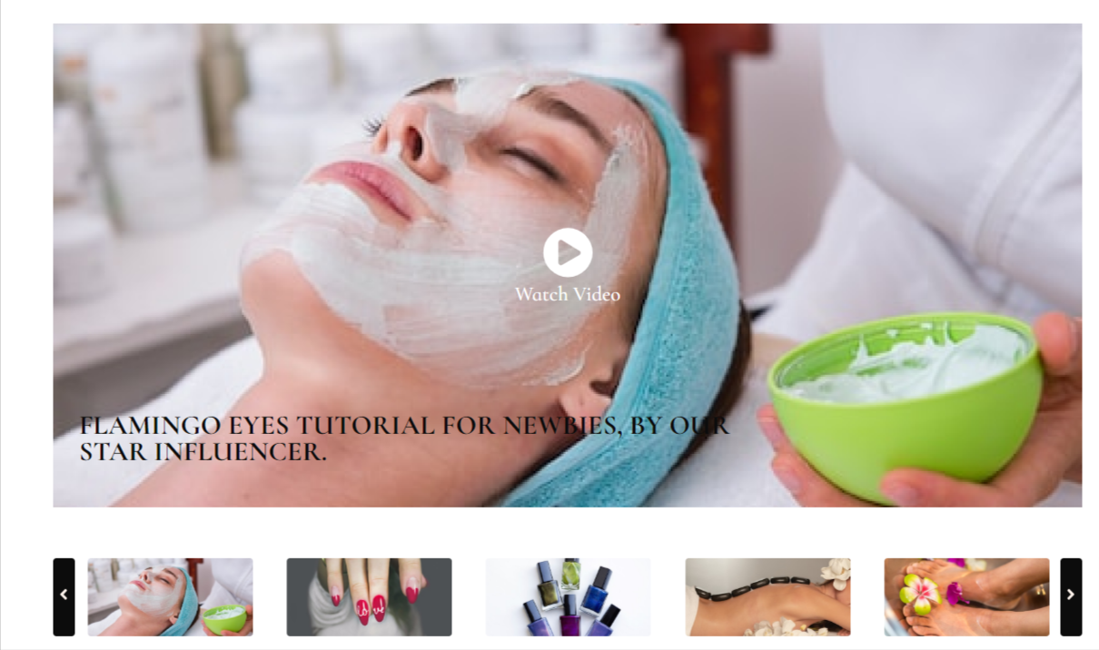
(b) Video slider
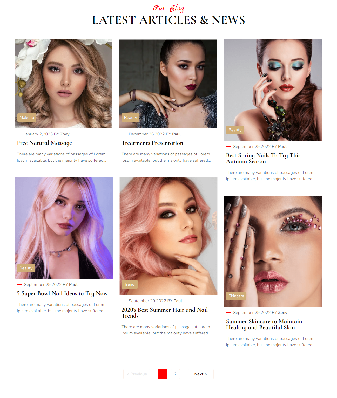
1.1.2.5.5.Blog Grid
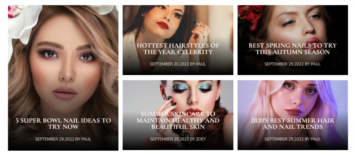
This module lets you display your blogs in the form of a grid. You can select any of the available layout for users to start reading instantly. It has the following 3 layouts: Use the card and compact layout of the blog when the feature image of the blog post is uploaded. If there is no featured image use the third layout card without an image.
(a) Compact with Image
(b) Card with image
(c) Card without image
1.1.2.5.11.Button
For accomplishing an action on your cafe landing pages, home pages, or even blogs you can use button module. It’s upto you to change it’s layout, text, and button color, etc. The button module has the following layouts:
(a) Filled Dark
(b) Filled Light
(c) Outlined Dark
(d) Outlined Light
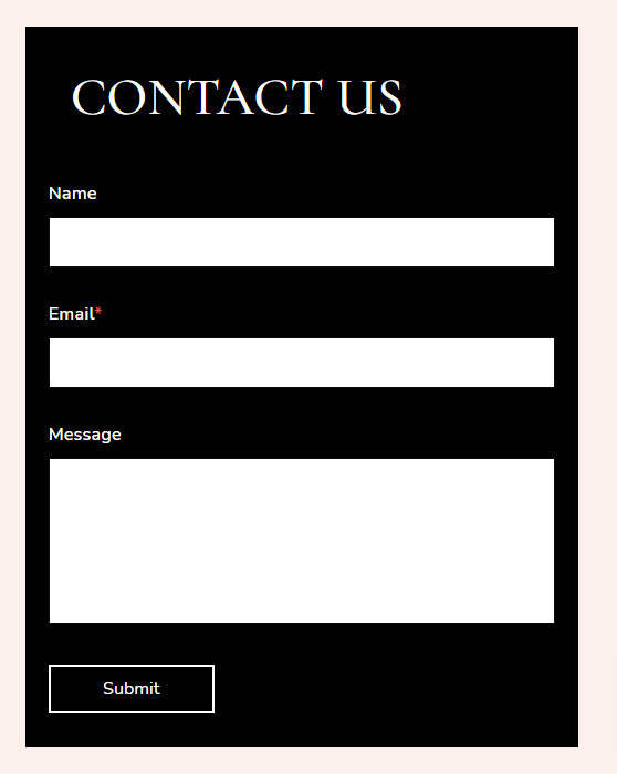
1.1.2.5.18.Form
Customer data is really important for your sales and marketing teams. So, use it wisely. The form module adds a form on your landing page. You can add or remove fields and customize it according to your needs. Some form examples are, contact us form, newsletter subscribe, etc.
You have three layouts of three form module:
(a) Multiple Field Form
(b) Single Field Form (side button)
(c) Single Field Form (button at bottom)
1.1.2.5.23.Icon Box
Add multiple icons and their descriptions on landing pages. The icon box module provides an area where you can display several cards. Each of these cards has a symbol, and you can choose how many cards to show in each column. You have two layout options:
(a) Card Layout
(b) Compact Layout
1.1.2.5.26.List
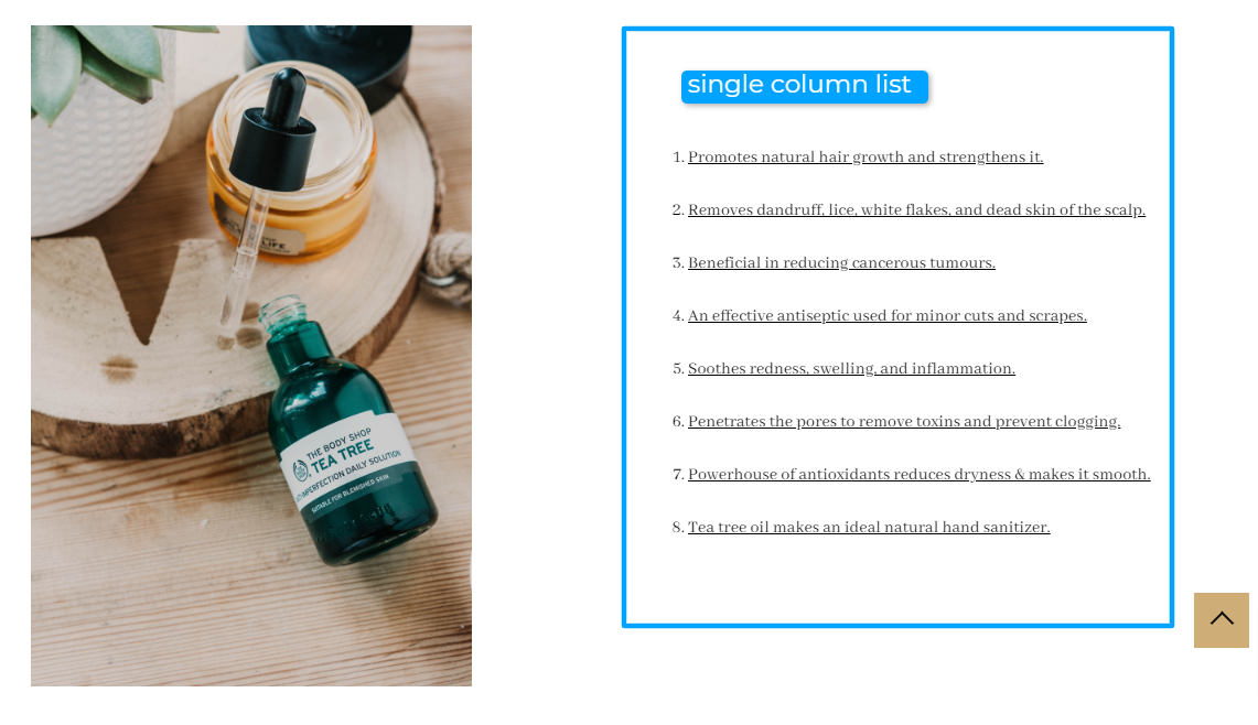
List module is a great one for displaying details in listicles, bullet points, or numbered lists. This helps users understand your product or service in a better way. It’s like giving them that many reasons to buy or take your service. From its settings, you can customize this list as like it. You’re allowed to set columns and list animations for devices.
1.1.2.5.28.Map
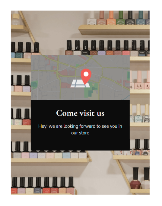
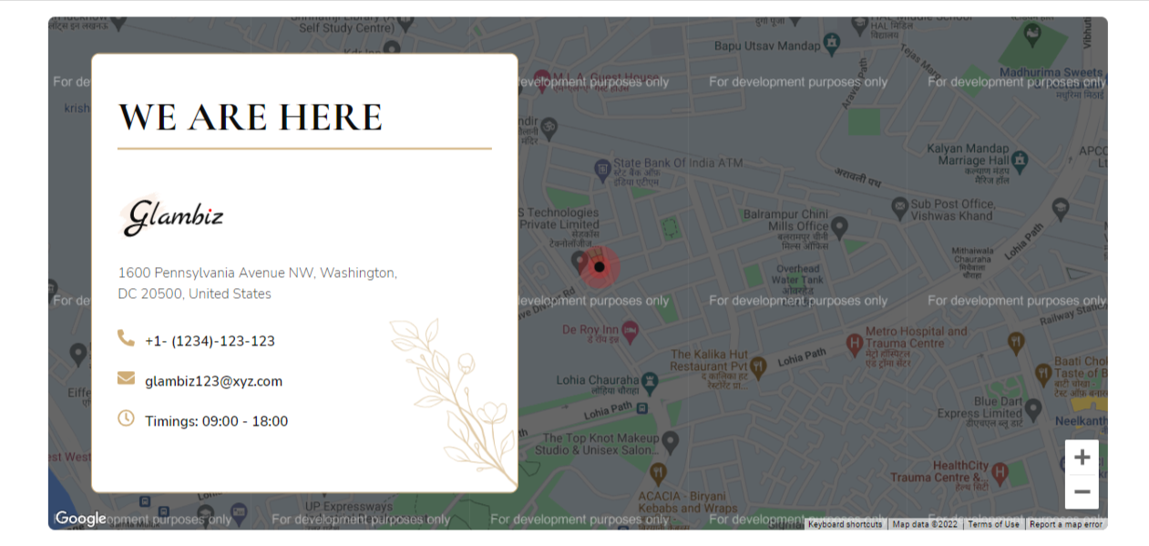
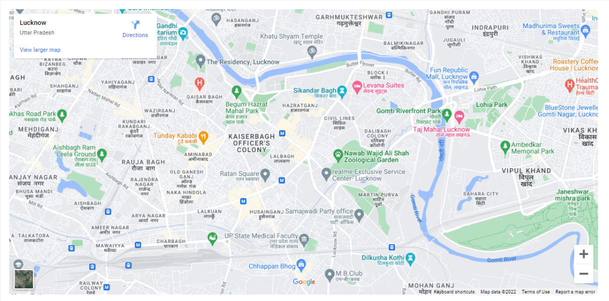
The map module will add a virtual map to your website. As a beauty spa and salon you can definitely add this module. It will help visitors to reach you without any hassle. Just add your loaction using Google maps. You have three map layouts for map:
(a) Card Map
(b) Single Loacation Map
(c) Iframe
(d) Multiple Location
1.1.2.5.31.Pricing Card
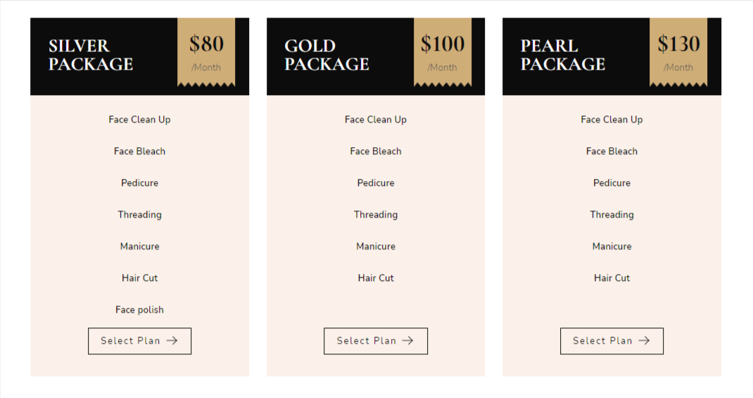
Pricing cards allow adding your beauty service their charges in the form of cards. You can customize it’s background color, edit the content, etc. If you have membership plans, you can use pricing card to display them too. There are two layouts for pricing card module:
(a) Parallax Image
(b) Grid Image
2.Website & Landing Page Templates
The Glambiz theme has the following templates:
- Homepage
- Homepage – Nail Art
- Homepage – Spa
- About us – Company
- About us – Individual
- Services
- Service Details
- Products Listing
- Products Detail
- Contact us
- Team
- Testimonial
- Gallery
- Pricing
- Events Listing
- Appointment Landing Page.
- Event Landing Page.
- Blog Listing
- Blog Details
- Blog Listing Masonry
- Coming Soon
- Thank You one
- Thank You two
Read More: Easiest Ways To Customize HubSpot Templates
3. Reusable Sections
There are 8 reusable sections in Glambiz theme.
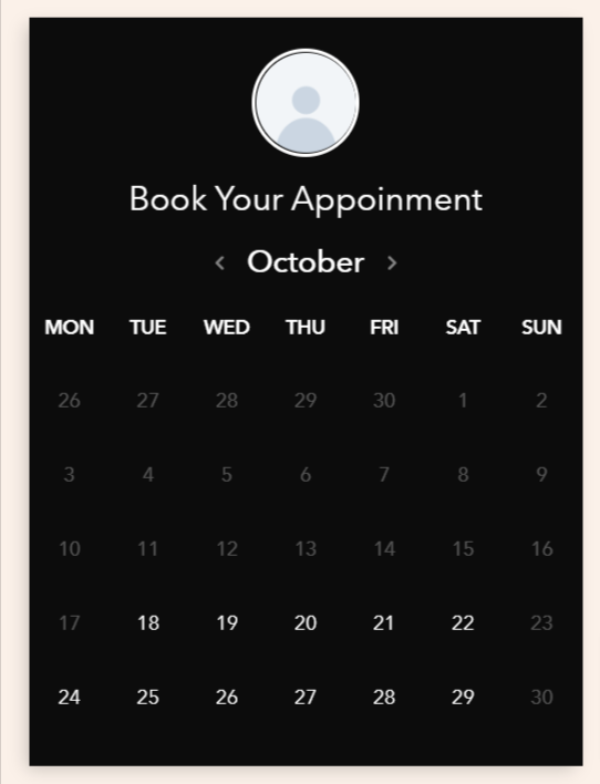
- Booking
- Icon box and Form
- Two-column Content and Image
- Two-column Image and Content
- Two-column Content and Video
- Two-column Form and Map
- Two-column Map and Content
Read More: How to use reusable sections?
4.Editing Blog Pages
Blogs are a great way to interact with users and deliver information on various topics. The premium blog templates from the Glambiz HubSpot theme are highly editable to your needs.
There are three blog templates available:
- Glambiz Blog Grid
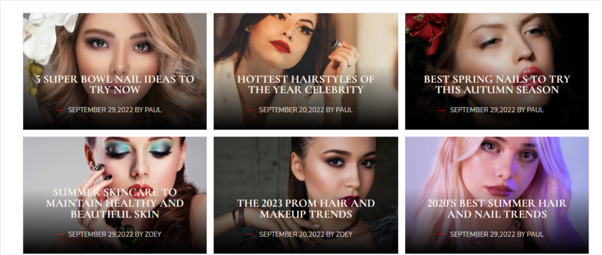
- Glambiz Blog Masonry
- Glambiz Blog Detail
To edit the blog grid template, you can follow this path:
- Go to marketing > blog > select Glambiz blog grid. When you hover over the listing page, you will see three options. Edit, View & Detail. If you click the edit option, you will be able to check & edit the blog listing module.
To edit the Glambiz Blog Masonry template, follow these steps:
Go to marketing > blog > select Glambiz Masonry Blog from dropdown. When you hover over the masonry blog listing page, you will see three options. Edit, View & Detail. If you click the edit option, you will be able to check & edit the blog masonry listing module.
5.Editing System Pages
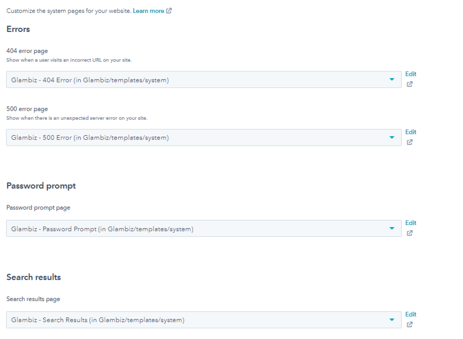
The general system page settings have been discussed above under the edit theme settings option. For applying Glambiz system pages,
- Go to settings > website dropdown (lower left corner of screen) > pages > system pages (from top tabs) > select the system page from drop down for different error pages, etc.
The Glambiz HubSpot CMS theme has the following system pages:
- Error 404
- Error 500
- Backup Unsubscribe
- Subscription Preferences
- Subscription Confirmation
- Search Result
- Password Prompt
- Membership Login
- Membership Register
- Membership Reset Password
- Membership Reset Password Request
Read More: How to change system templates?
6.Theme Support
Glambiz is a premium HubSpot theme catering to your HubSpot CMS needs for your cosmetic & beauty eCommerce efforts or makeup, spa & salon service website. In case, you have any queries regarding theme customization or consultation contact us on this page by filling out a form.
























1.1.2.5.33.Social Follow
Everybody is on social media these days. In fact, as a luxury beauty spa owner, you must be active on all social media platforms. Sign up on the most popular ones and you can add social icons on your landing pages. In this way your visitors can tag and follow you on every platform.