
1.Overview
2.Features Included
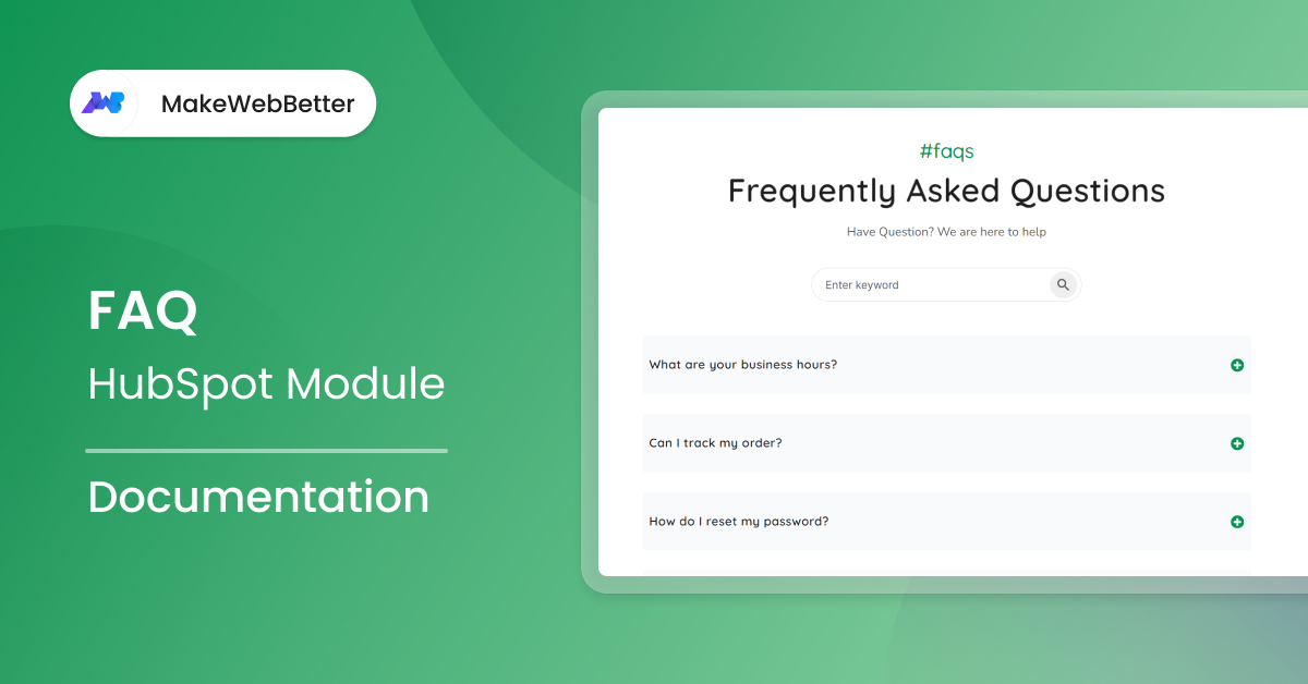
The FAQ Module in HubSpot offers beneficial features for your web page to help drive more traffic and offer transparency.
These features include:
- Adding endless questions & answers.
- Search functionality to easily find specific questions or keywords.
- Ability to add, delete and reorder questions and answers.
- Marketer-friendly module with a clean and simple design.
- Customizable colors and styles for the accordion and text.
- Mobile-responsive design for optimal viewing on different devices.
3.Module Benefits
The FAQ module
- Helps to establish trust and credibility with potential customers by providing clear and accurate information.
- Increases website engagement and reduces bounce rate by keeping visitors on your site longer.
- Potentially reduce the number of support tickets or inquiries your team receives.
- Improves SEO by using relevant keywords and phrases in the questions and answers.
- Enables you to gather insights into your customers’ concerns and questions, which can help inform your marketing and product development strategies.
4.Module Set up
Setting up the Faq Module is easy and straightforward. All you have to do is perform a simple drag and drop.
Now let’s go through the setup steps:
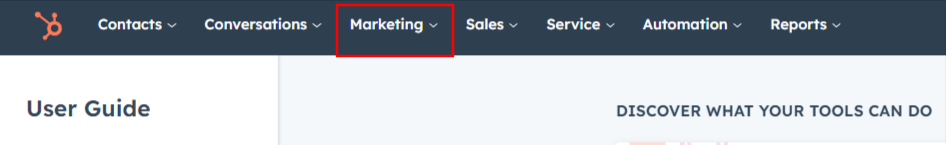
- First, log in to your HubSpot account and navigate to the “Marketing” tab.
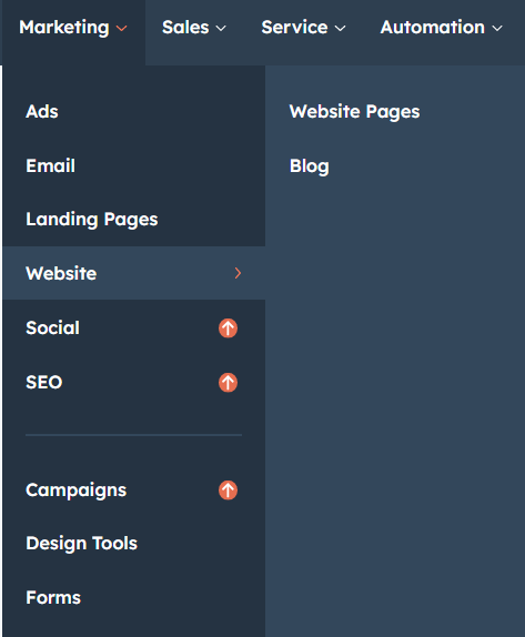
- Click on “Website” in the dropdown menu and select “Website Pages” from the extended menu.
- Select the template and create your web page as usual. Under the module selection menu, search for “FAQ” and select the module
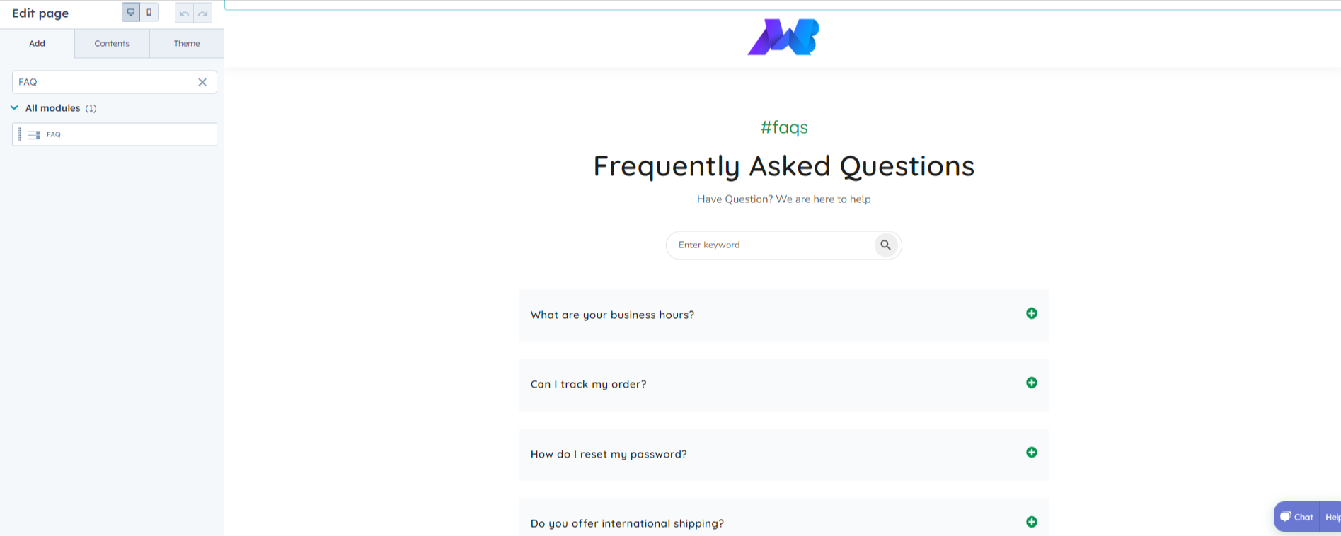
- Now simply pick the FAQ module, drag, and drop it wherever you want on your page. You’ll see a new module appear on the page.
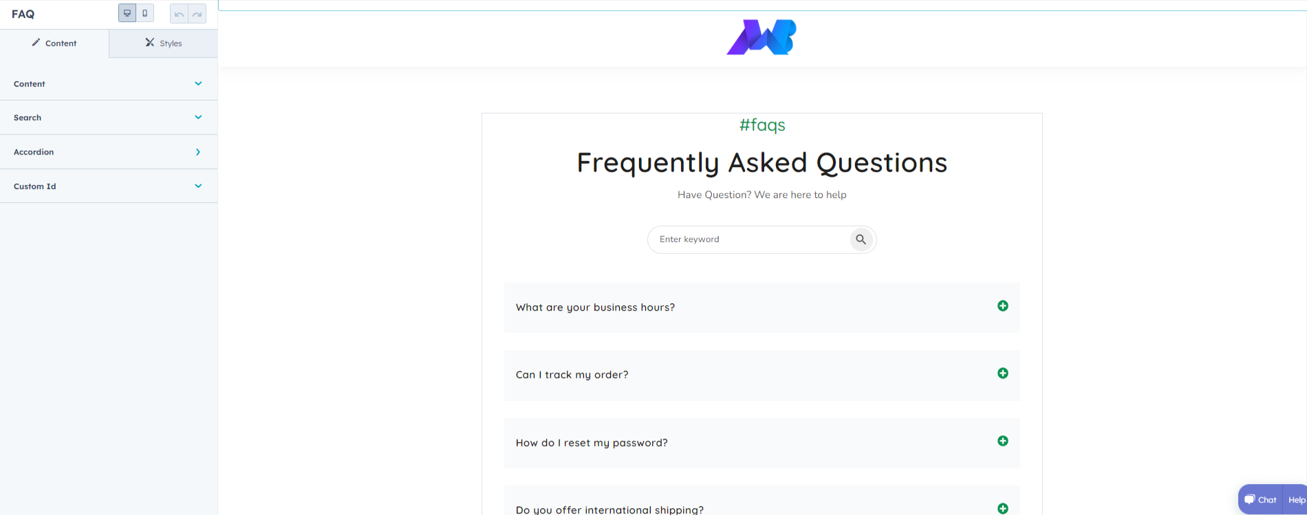
5.Module Settings
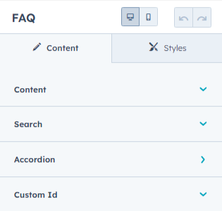
5.1.Content
- Under “Content”, you can edit the content you want to be displayed on your FAQ section. Easily adjust and update the “Mini Title”, “Heading”, and “Description” as you please.
- The “Search” dropdown lets you enable or disable the search functionality above the FAQ section by switching the toggle button. You can also change the placeholder text on the search bar, as it appears on the section.
- Moving on, set your “Accordion” to present information in a user-friendly way.
- Column Count: Choose whether to have a two column FAQ setup or keep it simple with the one column setup.
- Under the same menu, you can define the number of questions you want on your webpage. Further clicking on the question tab, update the questions and their answers.
- Icons: Display the opening and closing of desired questions with icons and make your page interactive.
- The ”Custom Id” lets you add unique custom ids to the FAQ section. Using a toggle button you can enable or disable the custom ID.
5.2.Styles
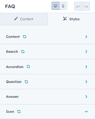
- Content
- Container: Adjust the content bottom spacing and width that will show on both the mobile and desktop.
- Alignment: Align your content according to the view you want on your preferred device.
- Mini Title: Change the style, font, line height of the mini title for both desktop and mobile.
- Title: The settings on the title option are similar to those of the mini title. Here also you change the font size, font type, line height, etc., for desktop users, and the line height and font size for mobile view.
- Description: Similar to the settings of the title and subtitle, you can make changes in the description box.
- Search
- Spacing: Alter the bottom spacing on desktop and mobile view. Just put in the number and save settings for both views.
- Input Field: Here, you can change the search input fields’ text color and background color. You can input the hex code for the same.
- Icon: Here, you can change the icon color and background color of the icon.
- Hover: While hovering over the icon, you can change its color as well as the background color.
- Accordion
- Background: To change the background color of the accordion, you can input the hex code and it will be reflected on the screen.
- Border: This option allows you to edit the accordion border style. You can change the border style, color, and width. Additionally, you can tick the checkbox to apply these same settings to the bottom only.
- Corner: Just simply drag the slider to increase the border radius.
- Spacing: This section deals with the spacing of the accordions. Each FAQ shall be at an equal distance from each other.
- Max width: To enable the maximum width for the accordion, use the toggle button and set the width to whatever you please.
- Box shadow: Enable or disable the box shadow with the help of the toggle button.
- Question
- Typography desktop: Under this setting, you can change the typography of the desktop view, including font, color, line height, etc. of the questions.
- Typography mobile: Under this setting, you can change the typography of the mobile and line height for the mobile view of the questions.
- Spacing: Here, you can adjust the spacing of the margin above and the margin below, along with the padding for each question.
- Answer
- Typography desktop: It is the same as we discussed in Question.
- Typography mobile: Functions exactly as it does for Question.
- Spacing: Also functions just like in Question.
- In the “Icon” menu, you can change the icon color. Just mention the hex code for the color you want.
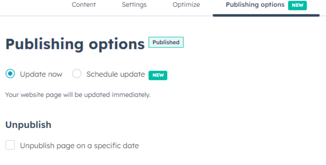
6.Publishing Page
Finally, just save and publish the changes to your webpage by clicking on the “Publish” button in the top right corner of the page editor.
That’s it! Your HubSpot map module should now be live on your webpage, displaying the location(s) you’ve set up.
7.Custom HubSpot Modules
We hope you’ll love working with our FAQ module and create a seamless experience for both your users and marketers on your team. Here at MakeWebBetter, we strive to make your experience with HubSpot a better one!
Just in case you have a custom HubSpot module requirement or need a customized HubSpot CMS or CRM setup, hit us up.