
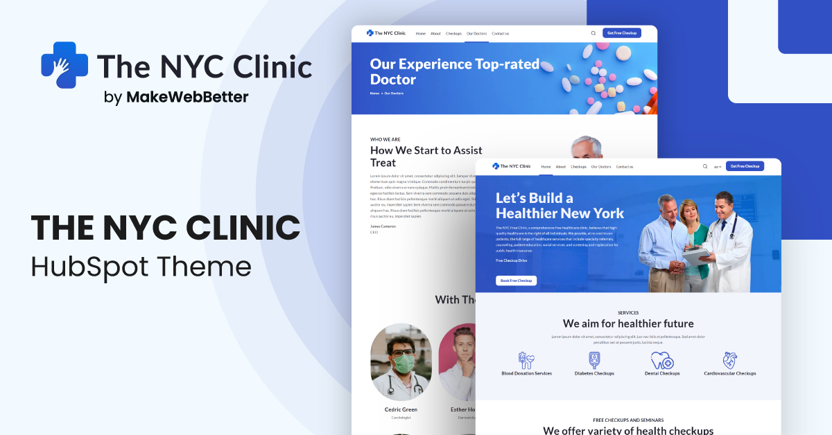
1.Overview
- 20+ customizable drag and drop module
- Quick customization with easy theme settings
- Fully responsive pages
- Speed optimized pages
2.What's Included?
NYC Clinic theme offers,
- 31 Modules
- 6 Sections
- 6 Templates
- 2 Blog Templates
- 7 System Pages
Note: If you want to add any feature/module/template to your theme, Contact Us, share your requirements and we’ll get it done for you at affordable prices.
Let us begin with the theme documentation.
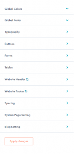
3.Edit Theme Settings
Through the edit theme setting, you can make global changes to your HubSpot theme. For navigating to the theme settings,
- create a page using the theme > on the edit page panel > click on Theme > Edit Theme Settings.
You’ll find the following settings here:
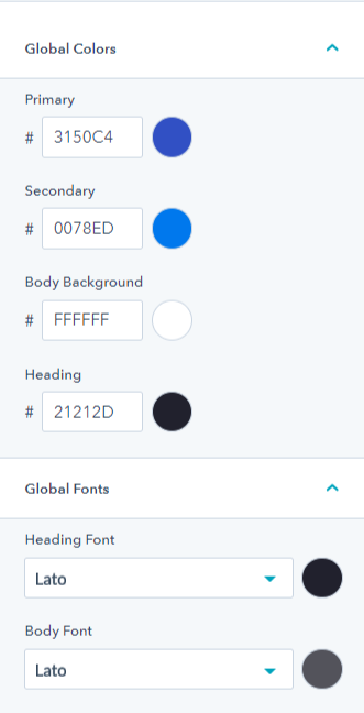
3.1.Global Color And Font Setting
Global Colors setting lets you configure primary & secondary color, body background, and heading colors. Similarly, the Global Fonts setting lets you change the Heading font and Body font of the theme.
3.2.Typography
This setting lets you tweak the headings from H1 to H6 along with the body and links.

3.3.Buttons
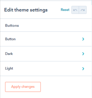
You’ll find the following settings here:
- Button: Includes option to edit button text, spacing, corner radius, and enabling animation.
- Dark: Includes the option to change normal hover and active button font, text color, background color, and border style for the filled and outlined button.
- Light: Change the light-filled button text background border color for normal, active, and hover cases.
3.4.Forms
The following form sections have these mentioned settings for forms:
- Titles: Edit text (font, line height, letter spacing, text transformation), background color, spacing, and corner radius. The border radius only alters the top left and top right of the title.
- Labels: You can edit the text and spacing of the form labels.
- Help text: Change the font of the help text on forms.
- Fields: Change the font of the GDPR Text and Rich Text, alter border radius, change border color on focus, border style, spacing, background color, text, and placeholder color of the input fields.
- Form: Alter form background color, mobile and desktop spacing, border style, and corner radius of the form.
- Error Messages: Change font, alter spacing, and border color of the error messages.
3.5.Tables
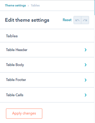
The tables option has a further 4 sub-options.
- Table Header: Change table header text color and background color.
- Table Body: Change table body text color and background color.
- Table Footer: Change table footer text color and background color.
- Table Cells: Change spacing, padding, and border of table cells.
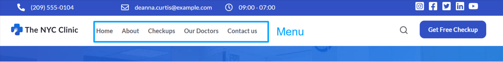
3.6.Website Header
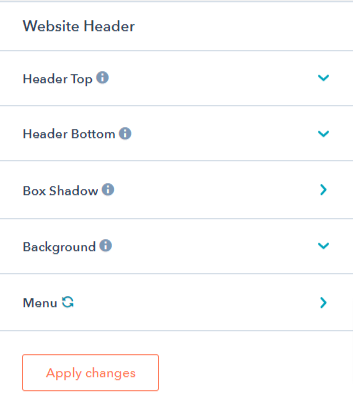
The website header has 5 sub-settings.
- Header Top: Enable or disable header top.
- Header Bottom: Enable or disable header bottom.
- Box Shadow: Enable or disable box shadow and change box shadow color.
- Background: Change website header background color.
- Menu: Change menu text, hover and active font, change drop down text and background color hover text background and active text color.
3.7.Website Footer
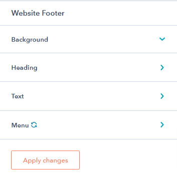
You can edit the website footer with the following options:
- Background: Change the background color of the website footer.
- Heading: Change mobile font size, line height, desktop font, line height, and text transformation.
- Text: Change website footer text for desktop (font, line height, and text transformation) and mobile ( font size & line height)
- Menu: Change footer menu text and background color.
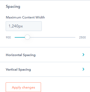
3.8.Spacing
You can adjust the horizontal and vertical spacing on desktop and mobile from the spacing option.
3.9.System Page Setting
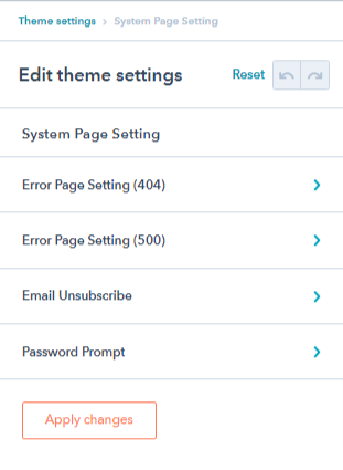
You can use the system page settings to make changes to system pages. There are 4 settings here,
- Error Page Setting (404): Enable/disable the error image, and change the error banner image from here.
- Error Page Setting (500): Enable/disable the error image, and change the error banner image from here.
- Backup Unsubscribe: Enable/disable the banner image, and change the backup unsubscribe banner image from here.
- Password Prompt: Enable/disable the password prompt image, and change the password prompt banner from here.
3.10.Blog Settings

You can configure the blog post settings here. There are 2 settings in this section:
- Sidebar: Enable or disable the sidebar on the blog from here.
- Blog Post: You can show/hide the author name, image, timestamp, tags, and related posts from here.
4.Theme Modules
Check out the complete list of 25 modules you get with this NYC Clinic theme:
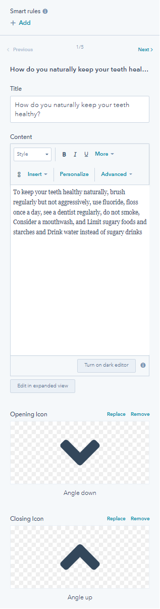
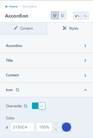
4.1.Accordion
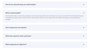
The accordion module is used to add popular or most asked questions in the form of FAQs to your landing pages
It has several settings.
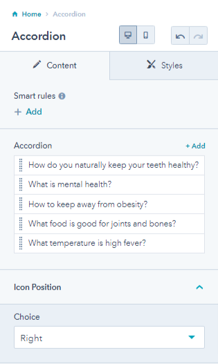
- Add multiple accordions, and choose icon position.
- Edit each accordion title, description, and replace or remove the accordion open and close icon.
From it’s style tab, you can change the
- accordion background color, spacing, border radius, and box-shadow
- title font and spacing, content font and spacing
- Overwrite icon color settings
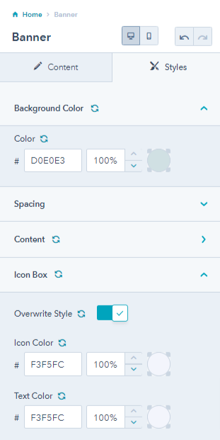
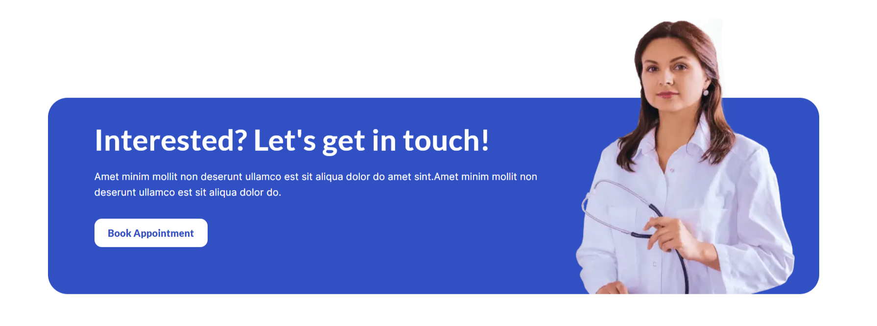
4.2.Banner
The banner is the first thing that the visitors check out as soon as they land on your website. You can add and edit the NYC Clinic banner according to your needs.
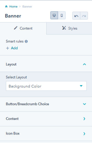
Banner has the following settings:
- Layout: Choose a banner layout from three options, i.e. background color, background image, or banner with image.
1. Background color
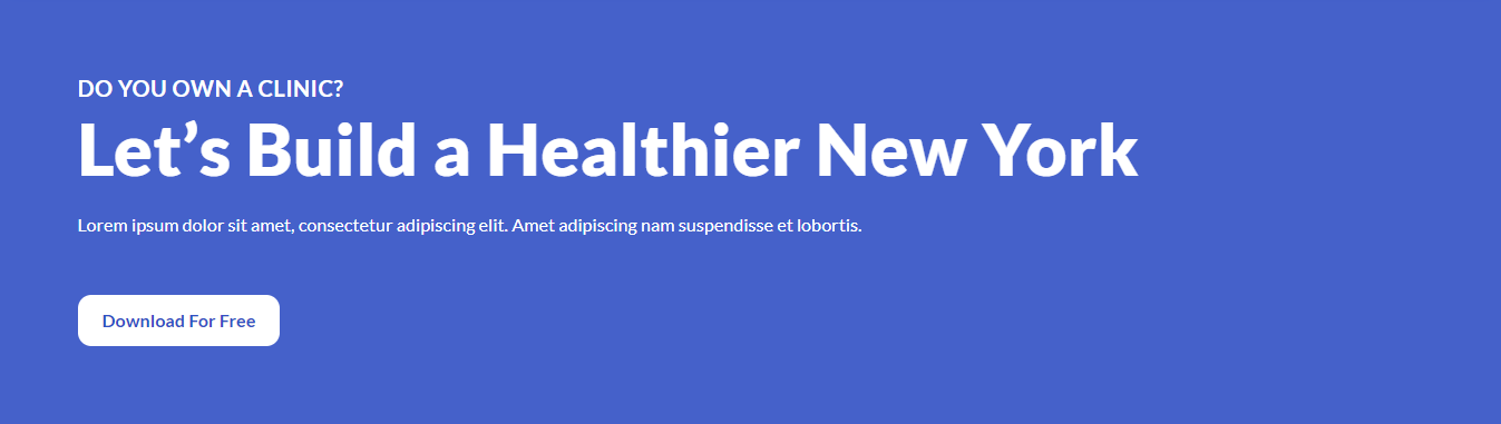
2. Background image

3. Background image

- Button/breadcrumb Choice: Select button or breadcrumb for navigation.
- Content: Enable mini title, add & edit content, enable primary and secondary buttons with links, change button style between outlined, filled, or dark style buttons, and edit the button text.
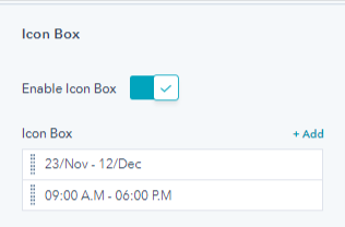
- Icon Box: Enable an icon box on the banner, add multiple icon boxes, and edit the text of the icon box.
Its style tab has the following settings:
- Background color: Change the banner background color
- Spacing: Adjust desktop and mobile spacing
- Content: Choose a content alignment for mobile and desktop, set a maximum width and enable it, overwrite content color by changing the text and title color, and change banner text color for mobile devices.
- Icon Box: Overwrite icon box settings by changing icon color and text color.
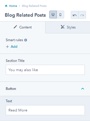
4.3.Blog Related Post
You can add related posts to your blog page for readers to dig into other pieces.
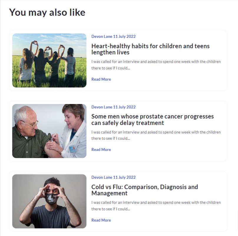
You can edit the section title and the button text.
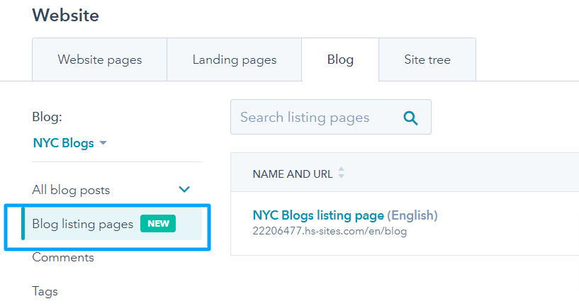
4.4.Blog Listing
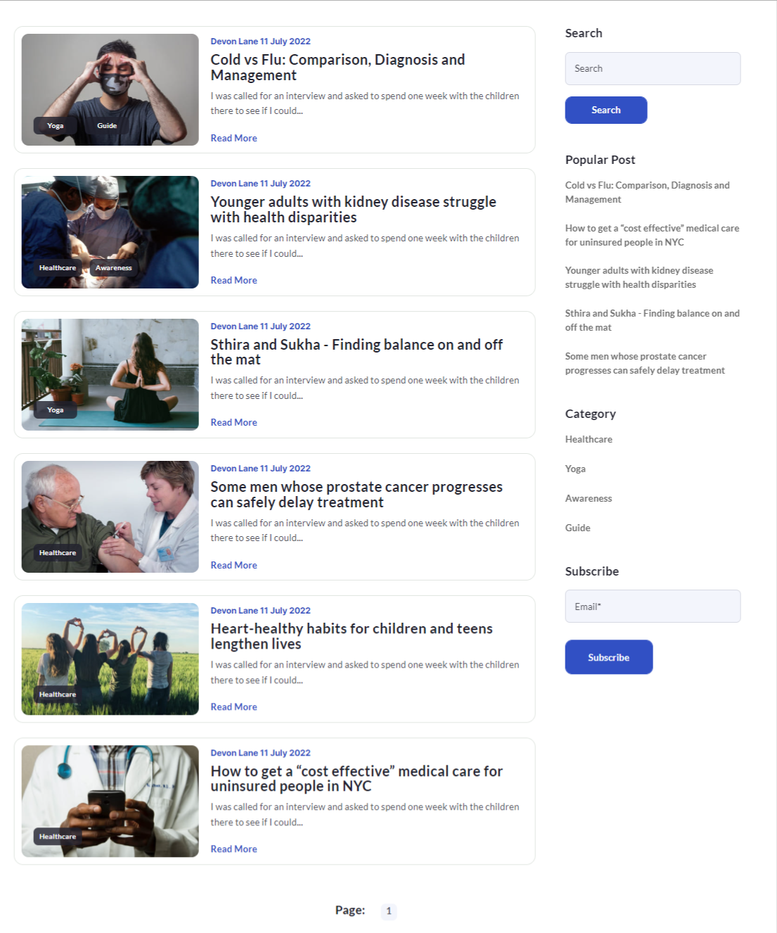
You can check the blog listing module on the blog listing page. For accessing blog listing page:
Go the marketing > website > blog. From the left panel select blog listing pages and select the NYC blog listing page > Click edit and you will find the blog listing template.
The following is a screenshot of what the blog listing page will look like:
Further on the blog listing module, you have the following settings:
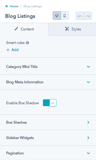
- Category Mini Title: Add a category mini title on the blog listing page.
- Blog Meta Information: Enable or disable blog meta information like feature image, tags, title, author, description, and button. You can also edit the button text.
- Enable box-shadow: Enable or disable box shadow for blog listings.
- Box shadow: Enable Inset, adjust the vertical and horizontal value, blur, spread, and change shadow color.
- Sidebar widgets: Edit search title and button text, popular post title, category title, and search title.
- Pagination: Edit left and right pagination text.
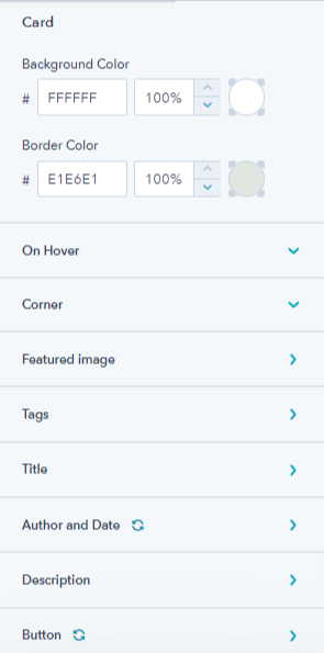
From the style tab, you can edit cards and widgets. For cards, you can
- Edit card background color and border-color
- Overwrite card hover color styles, i.e. change the text color of author & date, title, description, and button text.
- Adjust the corner radius of the card and feature image, overwrite styles of tags, title, author & date, description, and button.
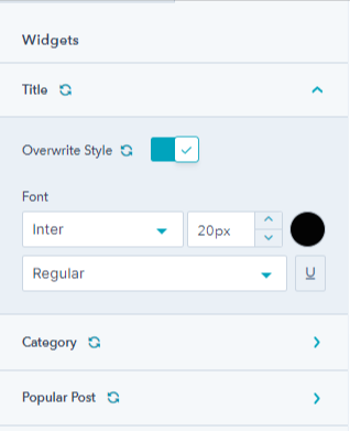
For widget styles you can overwrite styles of title, category, and popular post widgets.
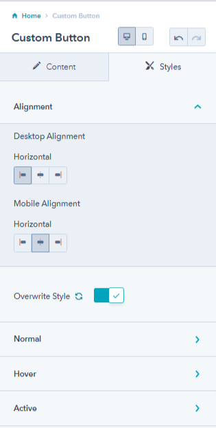
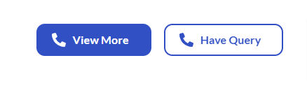
4.5.Custom Button
You can add a custom button to your landing pages using the button module. The button settings include:
- Choose the button type from filled dark, outlined dark, and filled light, edit button text, and replace or remove the icon.
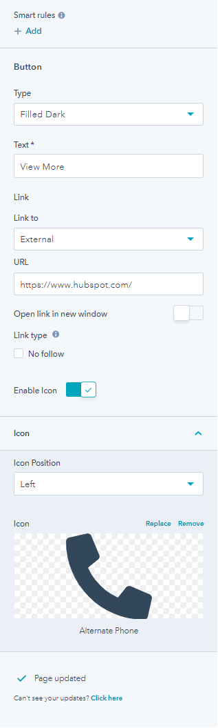
There are three button types in the custom button module:
1. Filled Dark

2. Outlined Dark

3. Filled Light

From the style tab, you can change the desktop and mobile alignment for the button, and overwrite the button style by changing font, line height, background color, border color and style, and spacing for normal, hover, and active state of buttons.
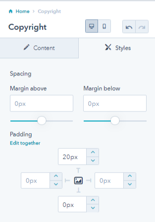
4.6.Copyright
The copyright module lets you add copyright text on the bottom of the page along with privacy policy, terms and conditions page links.
You can edit the copyright text, privacy policy text, and link. Similar settings are available for terms and conditions.
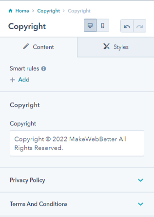
The style tab allows adjusting spacing of the copyright module.
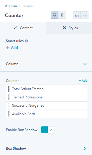
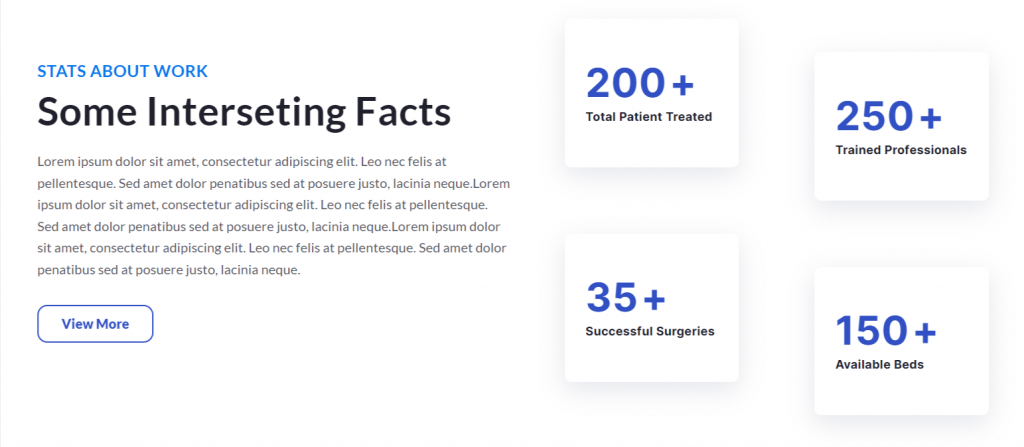
4.7.Counter
The counter module allows you to add numbers on the landing page. It could be for showing your achievements.
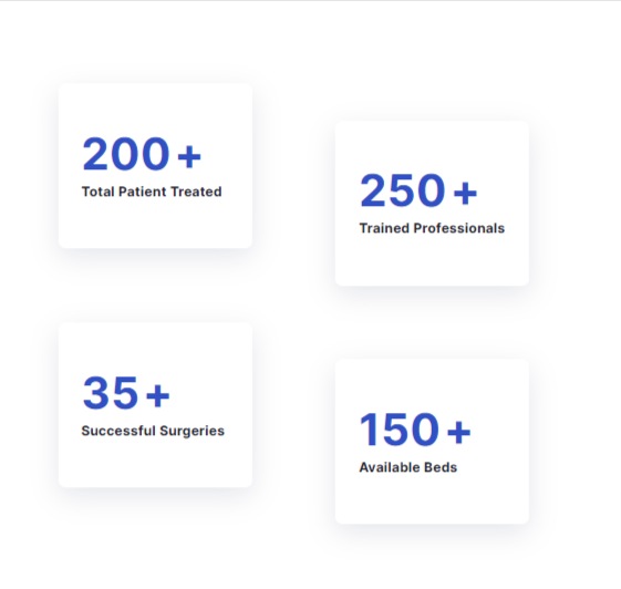
You can add multiple counters and enable the box shadow for these counters.
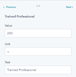
You can edit the counter text, unit, and value.
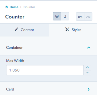
From the style tab, you can change the container’s maximum width and card alignment and spacing. You can overwrite styles too.
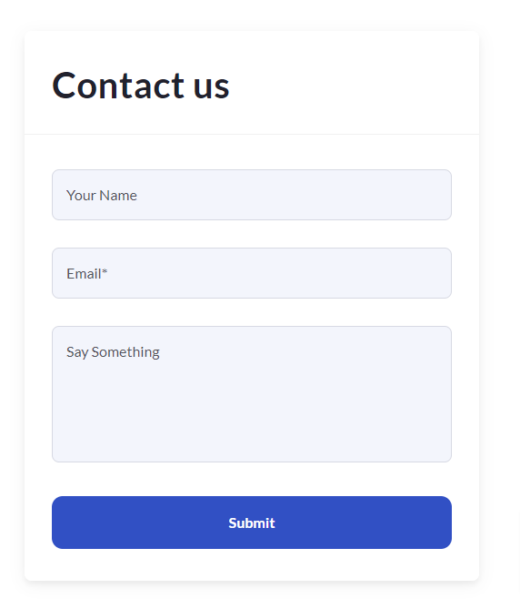
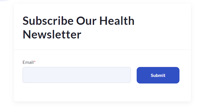
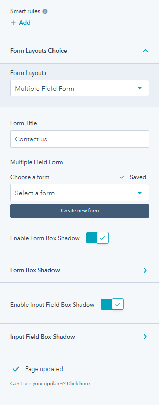
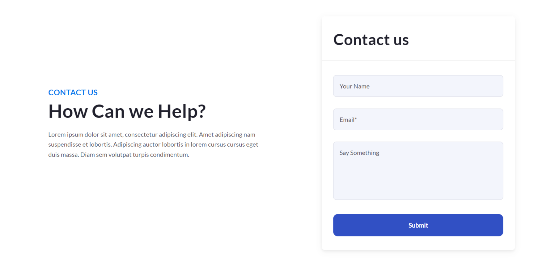
4.8.Custom Form
Add a custom form according to your website’s requirements.
1. Multiple field form
2. Single inline form
3. Single Field Form With Button at Bottom

You have the form layout choice between multiple field form, single field inline form, or single field form with a button at the bottom, edit the form content like add or remove fields, thank you text, enable form automation, enable form box shadow, enable input field box-shadow, and edit input field box shadow.
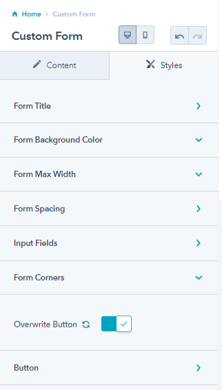
From its style tab, you can edit the
- color, border, and alignment of form title
- Enable and change the form background color
- Adjust form spacing, enable form max-width
- Overwrite desktop and mobile form spacing
- Overwrite background color and enable or disable the global border on the input field.
- Overwrite form corner radius, and button
- Change the text color, background color, and border color of normal and hover button.
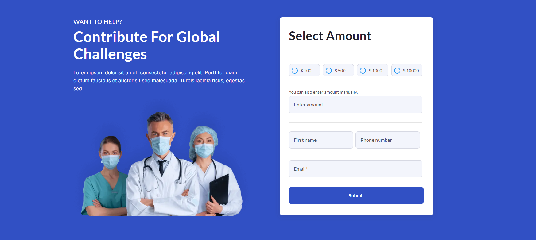
4.9.Donation Form
If you are keen on collecting donations from your website for the greater good you can easily add a donation form using this module. There are many nonprofit organizations that govern hospitals and health centers. They can use a donation form successfully.
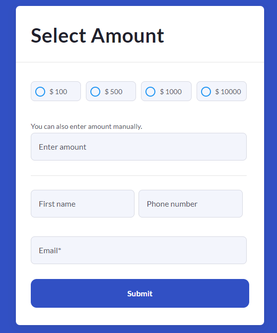
From the donation form you can:
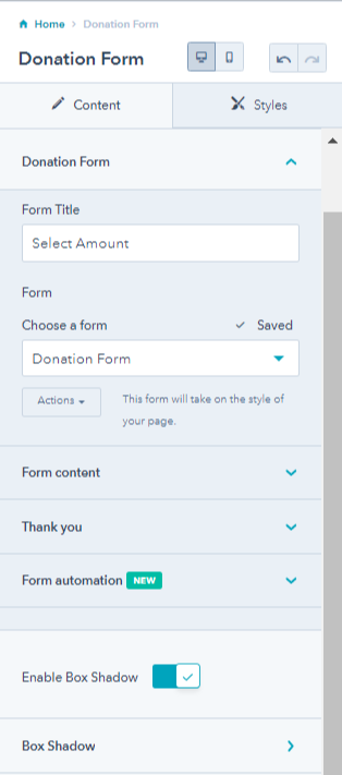
- Select a donation form from an existing form or create a new one, edit the form title
- Edit form content like add/delete form field, edit button text, select GDPR options, and enable Captcha for spam prevention.
- Edit thank you message for this form. Please note that the thank you settings will apply to this page only.
- Enable form automation and add the form to a workflow.
- Enable box-shadow and add box shadows.
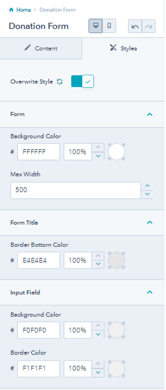
From the style tab of the donation module, you can overwrite the form, form title, and input field settings. You can
- Change background color and adjust max width form.
- Change border bottom color of form title.
- Change background color and border color of form input field.
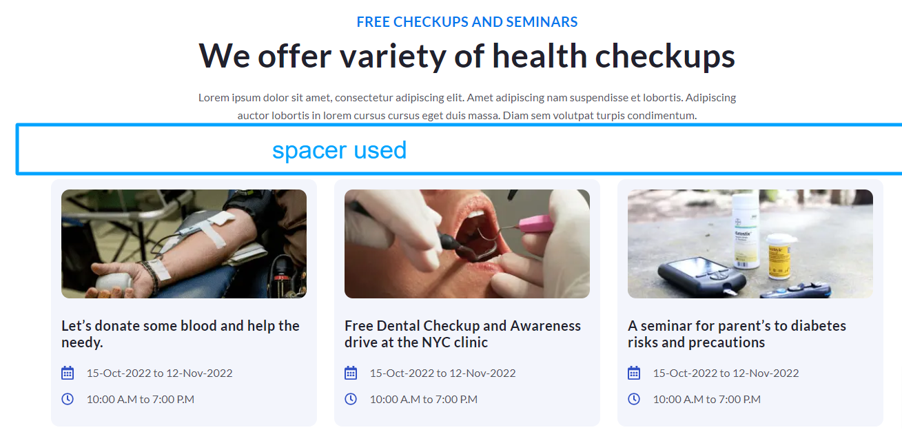
4.10.Event Listing
There must be regular or occasional events at your hospitals or clinics, like checkups, vaccinations, or seminars. For displaying any such information on your website, you can use the vent listing module.
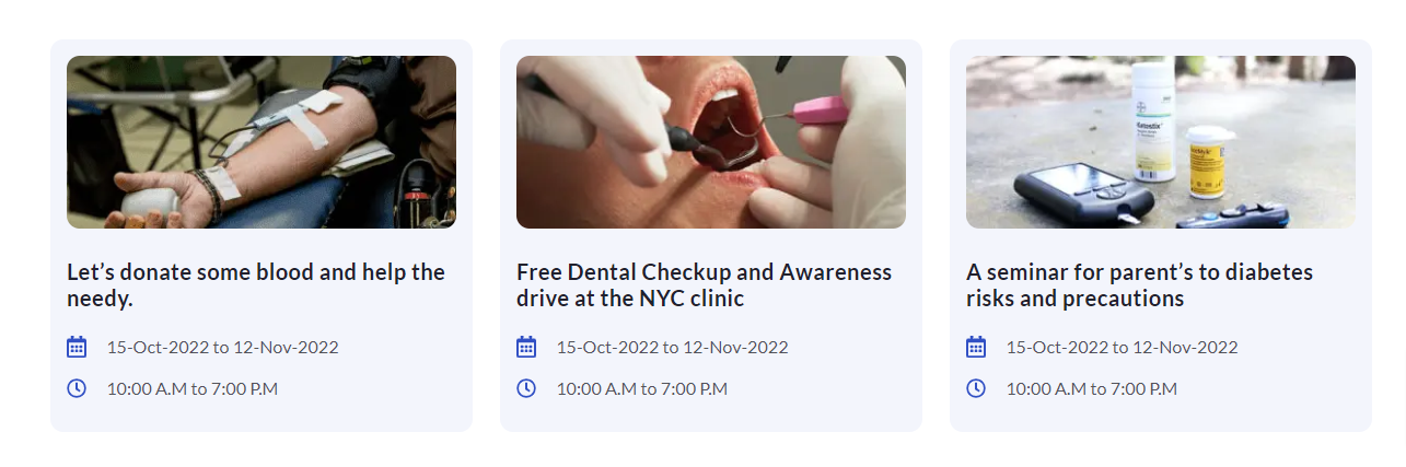
You can add multiple cards to your listings.
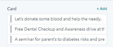
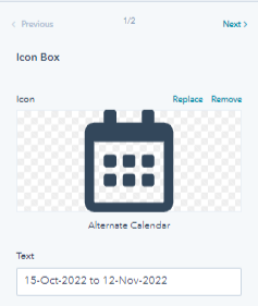
These cards can be further edited. You can change the card title, replace or remove the card image, add an event link and add multiple icon boxes.
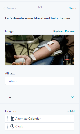
You can edit the icon boxes used in the cards by removing or replacing the icons, and change icon title.
4.11.Filter
Allow users to filter events and content like news listing by categories with the use of a filter module. You add multiple categories, tabs, and portfolios. By default, all cases are listed. But, the initial filter setting will allow users to set the initial filter only for a single category at a time.
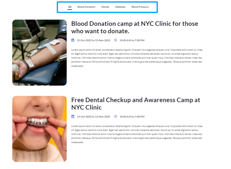
You can add multiple tabs and cards to the filter module.
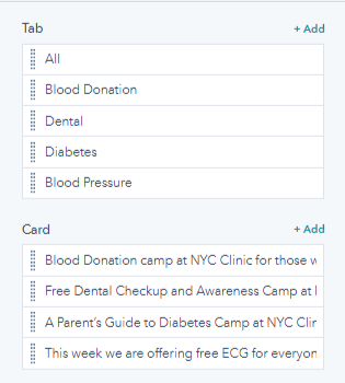
For further editing of each tab and card, you click the pencil icon that appears when you hover over a particular card or tab. You can also delete or clone tabs and cards. You can also
- Change tab name and tab ID
- Set the tab as an initial filter. If you set it as an initial filter, the users will originally see this tab as they enter your webpage.
For cards, you can
- Change the tab ID
- Remove/replace the image, add alt text and adjust the size.
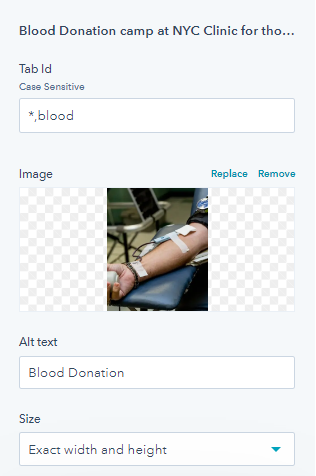
- Set height and width along with image loading
- Edit title of the card and add link.
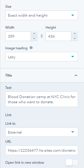
- Add description and edit icon box.
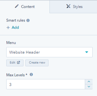
4.12.Footer Nav
The footer nav module can be added in the footer of your website with links to important pages.
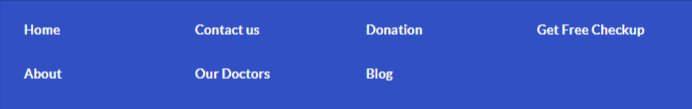
You can select a menu and choose the maximum levels you want to show.

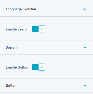
4.13.Header Controller
Header controller settings includes choosing the display mode, enable search, change placeholder text enable button on header, select button style, edit button text, and add a link to the button.

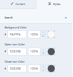
From the style tab, you can chang the search background color, open icon color, and close icon color.
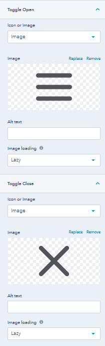
4.14.Header Toggler
The header toggler allows you to add a toggler to the header so that user can see more options.
Open Hamburger

Close Icon
You can edit the style of the header toggler by removing or replacing the open and close icon color, and the spacing and padding of the toggler. You can also add alt text and change image loading.
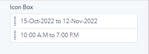
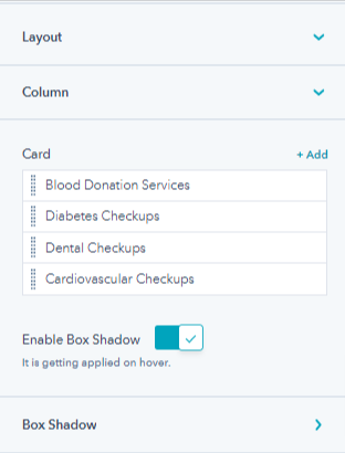
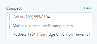
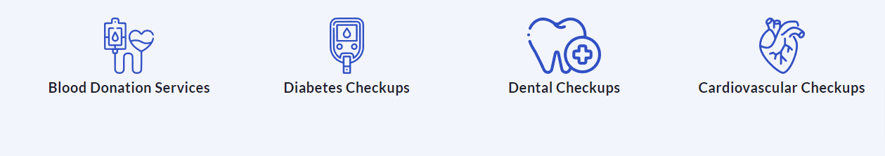
4.15.Icon Box
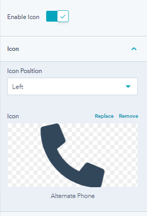
Icon box allows you to add multiple icons and their descriptions on landing pages.
You can change the icon box layout between card or compact.
1. Card Layout
2. Compact Layout

You can select columns, enable box shadow, insert shades, change card icons settings, and compact settings. From its style tab, you can change the icon box background color, and overwrite color settings by changing the title and description content color. You can also adjust spacing and overwrite icon color too.
4.16.Custom Image
The image module helps you add images anywhere on the landing pages.

You can replace or remove the image, add alt text, adjust the size, width and height of the image, and image loading.
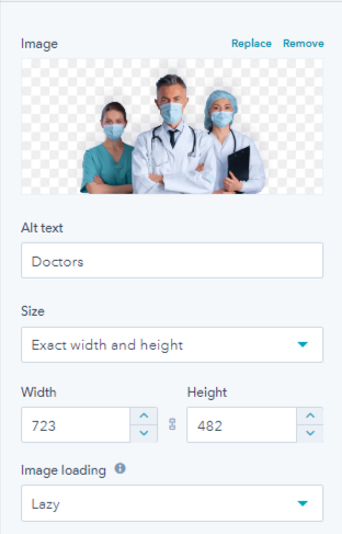
From the style tab, you can change desktop and mobile alignment and adjust the corner radius of the image.
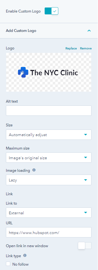
4.17.Logo
You can add a logo on your website pages by just dragging and dropping it anywhere you like.
You can enable a custom logo, replace or remove the custom logo, add alt text, and adjust the size and maximum size.
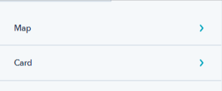
4.18.Map
The map module will add a virtual map to your website. You can replace or remove the location pointer, insert Map API, pointer details, Map JSON, map zoom level, edit center latitude and longitude.
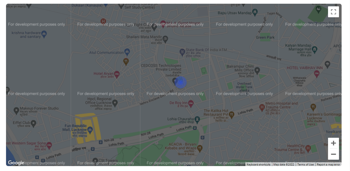
From its style tab, you can edit map corner and height, overwrite the style by changing title background and text color, card background and text color.
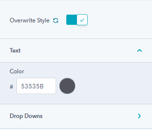
4.19.Custom Menu
You can add a custom menu on your header or footer to add links to important pages.
You get to choose the menu from the available options.
You can overwrite style settings by changing text and drop down text color, background color, and style, color & width of the border.
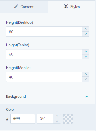
4.21.Spacer
The spacer module adds white space to the website and landing pages. With the spacer module, you can add vertical spaces between sections and modules as and when required.
The Spacer module does not have any editable option, but you can edit the spacer styles. You can change the spacer height for mobile, desktop, and tablet, and change the spacer background color.
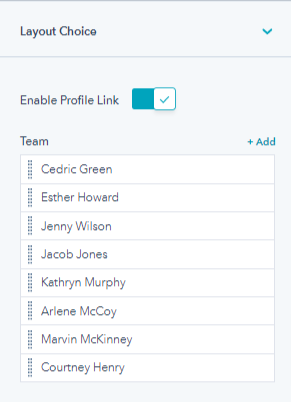
4.22.Team
You can use the team module to show the hardworking doctor’s team on your website pages. It helps customers to know your team virtually. You can
- Select team module layout between grid and slider
- Add multiple team members on the layout
- Enable member’s profile link
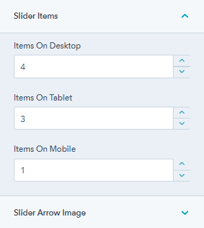
1. Grid Team Layout

2. Slider Team Layout

With the slider layout, you can select the number of items that should be displayed on the website slider for different devices, like desktops, tablets, and mobile. You can also remove or replace the slider next and previous arrow image and add alt text to each.
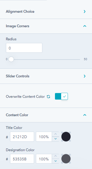
From its style tab, you can choose slider text alignment for mobile and desktop, adjust image corner radius, overwrite content color settings, by changing the title and designation text color.
4.23.Testimonial
You must have had patients and customers that visit your hospital or clinic regularly, and they all must say good things about you. Testimonials are a great way to win customer trust. Hence, you can add those trustworthy words to your landing pages with the testimonial module.
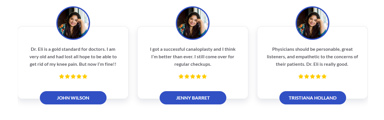
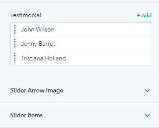
You can add multiple testimonials on your website, replace or remove the slider open and close icon with alt text, and set the number of slider items for mobile, desktop, and tablet.
For each customer review, you can replace or remove the customer image, add alt text, edit the client review description, edit the client name, and add a review rating.
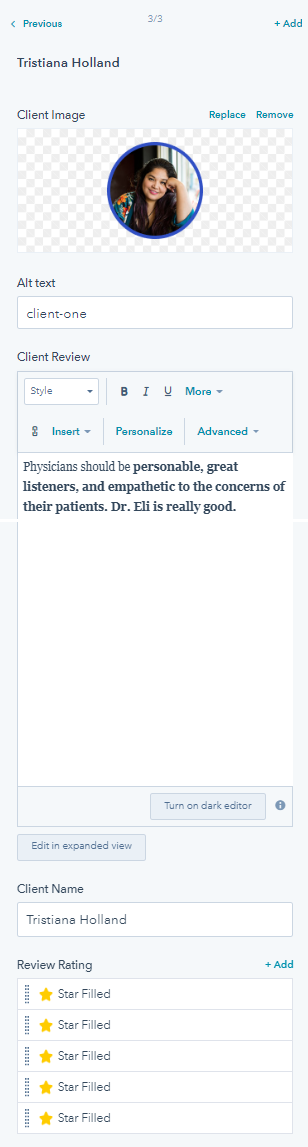
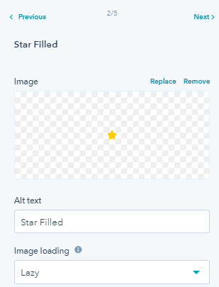
You can also edit the star filled icon by replacing or removing the icon, change alt text, and image loading.
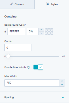
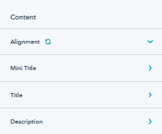
4.24.Title Content
The title content module helps you to add title text on any page. You can add a title above any module if you want to add a heading to it.
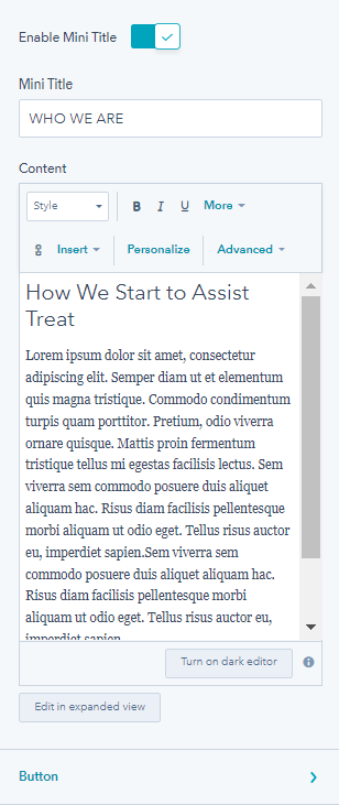
You can use the title to display content on your website. You can also
- Enable a mini title and edit its text
- Edit the content you want to show
You can also
- Enable primary and secondary buttons after the description in the title module.
Select button type, edit text and add a link to both primary and secondary buttons.
You can also enable or disable icons on these buttons and select the icon you want to display.
From the style tab of the title content module, you can edit the style of the container and content. You can change the container background color, adjust the container corner and spacing, and enable maximum width.
From content option you can edit
-
- Content alignment for desktop and mobile
- Overwrite mini title styles, by changing desktop font & color and mobile font size and line height.
- Overwrite title style, by changing desktop font & color and mobile font size and line height.
- Overwrite description style, by changing desktop font & color and mobile font size and line height.
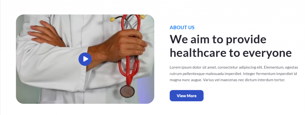
4.25.Video Popup
The video pop-up module allows you to add any video on your landing page.

You can replace or remove the video poster, its alt text, adjust poster size maximum image size, and image loading. You can also select icon over image or content over image, remove or replace the play icon, and add the video link.
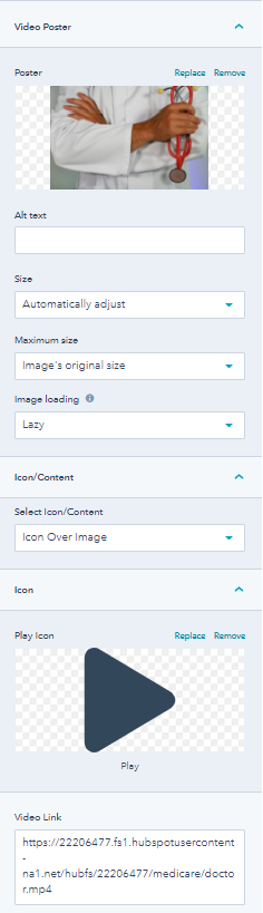
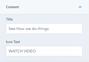
If you select content over video you can set a title and icon text.
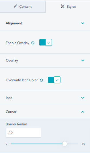
From the style tab, you can change video desktop & mobile alignment, enable overlay and change its color, change color, overwrite icon color settings by changing icon and icon background color, and adjust content border radius.
5.Theme Sections
This free HubSpot theme offers 6 different sections you can use on any page of your website.
5.1.Two Column Content and Image
5.2.Two Column Video and Content
5.3.Two Column Content and Counter
5.4.Two Column Content and Form
5.5.Donation Form
5.6.Call To Action
6.Theme Templates
This NYC Clinic theme comes with the following 8 templates,
- Homepage
- Who We Are
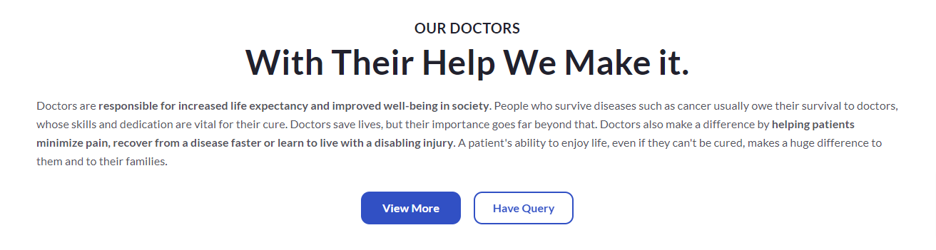
- Our Doctors
- Checkups
- Blog Listing
- Blog Detail
- Contact Us
- Landing Page
7.System Pages
NYC Clinic theme offers you 7 different system pages that are as follows,
- 404 Error
- 500 Error
- Password Prompt
- Search Results
- Backup Unsubscribe
- Subscription Preferences
- Subscription Confirmation
4.20.Social Follow
You can add your social media link to your website pages using the social follow module.
You can add multiple social links and edit them.
You can edit social icons, i.e. replace/remove social icons, and add the social link.
From its style tab, you can overwrite icon color, enable background color and change it, adjust corner radius, and social icon alignment for desktop and mobile.